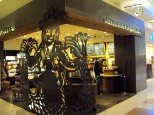
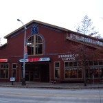
Starbucks opened a new store in Bellevue Square (a shopping mall in Bellevue, Washington) on Tuesday, November 17, 2009, and recently remodeled (within the past few months I think?) a long-standing store at Pier 55 in Seattle. At one point, I was only going to talk about the Bellevue Square store but I dropped by Pier 55 and found that the two stores have enough things in common and to talk about both stores.
Both stores represent another chapter in the Starbucks story of recycled and reclaimed materials for some of the store materials, and creating unique-store specific designs. Both stores offer in-store recycling for customers.
But what’s really worth talking about here is that these stores are just beautiful. They are just beautiful. And neither store was opened/remodeled with the same fanfare of a showcase concept store like 1st & Pike (“Heritage Starbucks”) or University Village. No, these are normal stores. This is an amazing thing to think about because what it signals is the wave of the future of Starbucks store design. Many stores taking cues from lessons learned from the early concept stores and integrated now into usual store design.
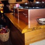
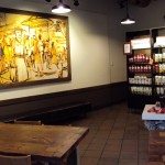
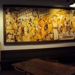
Pier 55 is stunningly beautiful. The woodwork throughout bar and tables, chairs, and bench is reclaimed from Seattle’s pier region – pier logs. There is no way that store design could have selected a more befitting theme. The mural in the store is earthy nostalgic Pike Place/ Seattle themed artwork. I heard from the barista that it originally hung in New Orleans at the 2008 Leadership Conference as part of a larger wall mural. It fits perfectly in that store.
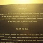
Bellevue Square uses maple wood reclaimed from a local Magnolia (a Seattle neighborhood) property, and interior door frame wood from fallen trees in California. A huge set of thank yous to the baristas at Bellevue Square who assisted me in taking a photograph of the Shared Planet sign in their store. It tells more information as to the re-purposing of the cabinetry and store furnishings. Both stores had helpful baristas!
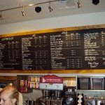
If you can visit these stores yourself, I recommend that. Better to see in person the thoughtful woodwork; but hopefully you’ll enjoy this photo tour:










Related posts
15 Comments
Leave a Reply Cancel reply
You must be logged in to post a comment.
Sponsors
Recent Comments
- DEVIN on Compostable Straws Land in Seattle Starbucks Stores
- coffeebeanz on Why do you go to Starbucks less often? (If that’s true for you)
- Willi on You can now buy a Siren statue: $6,000
- Willi on A major revamp of your drink recipe: Testing syrup extracts and cane sugar
- Skip on Why do you go to Starbucks less often? (If that’s true for you)


Thanks Melody, It’s such a treat to be able to see such beautiful Starbucks’ stores. So unique. Unfortunately all my local Starbucks were built during the company’s rapid growth and every store looks the same and has no personality. With one exception; there is a Starbucks very close by to me that sits in a shopping center whose theme is “Ol Route 66” (Foothill Blvd.) This Starbucks has a very “art deco” look inside and out befitting with the theme of the center. This location even has a fireplace. I should send you some pictures. Thanks again.
Good Coffee Day to You!
That woodwork is quite honestly stunning.
Those stores are truly beautiful, but I think that Starbucks is missing the full story on the reclaimed, reused, repurposed a.k.a. “green” remodeling efforts.
To be sure it is fantastic that they are using reclaimed wood and energy friendly lighting, but what are they doing with the old stuff? Did all of their old wood, fixtures, etc. end up in land fill? Was any of it reclaimed or repurposed?
If Starbucks remodels even a small percentage of their stores in an effort to promote their “Shared Planet” view of a green store, think of the negative impact and waste those remodels will generate.
My concern is that Starbucks is using “green” as part of their new story and identity. Remodeled stores promote that story as they generate buzz and everyone feels good about the “recycled” items, but what about “reducing” and “reusing?” The waste that was generated by remodeling these stores with recycled items from *other* locations is overlooked and this “feels” like a “slight of hand” technique to keep everyone’s focus on what Starbucks wants you to focus on.
I’m surprised you were able to get permission to photograph. I’ve never tried, because I’ve assumed I would be denied.
Seeing your photos makes me wonder if I should enhance my site with interior photos.
I probably won’t because I would rather spend the time visiting new stores than trying to revisit old stores with cool interiors.
Melody: thanks for sharing the photos and descriptions of these stores – they do look (and sound) beautiful. The title of your post included a reference to “community”, and yet the photos have no people in them, and the wonderful descriptions you provide focus primarily on physical attributes – vs. the less tangible social or community attributes – of the stores.
I remember reading an article by Melissa Allison in the Seattle Times about how the intent of the remodeling of the 1st & Pike and University Village stores was partly to help “enhance the sense of community” in those stores, and yet that article also focused primarily on the physical aspects of the remodeled stores.
I don’t know if your visits were during store hours or not, but I’m wondering if you have any insights to offer about the sense of community in these stores.
Thanks!
Hi Joe! That is a great point you bring up. I remember when I was writing the piece I was think about how the logs in Pier 55 store were locally sourced from the Pier, and how some of the wood in Bellevue Square came from a local home’s property in Magnolia (a Seattle neighborhood). It seems as if Starbucks is trying to tie new stores directly to their surroundings – their community.
But I often post on other sites about the parts of the Starbucks experience that cannot be measured: whether it is the 30 seconds at the register with exchanges in body language or the ‘feel’ of the store … these things are critical to the ongoing vitality and relevance of Starbucks.
It is my perception that these stores with their beautiful designs create partners more full of pride of the place that they’re working, and customers drawn back to them for their beauty. That overall creates a better Starbucks, yet it evades number-crunching.
was the pier 55 store recently remodeled or rebuilt? i don’t remember anything down on the waterfront looking quite like that, even from the outside (but, i haven’t been down there in a while either…).
I have got to check out the Pier 55 store later this week. These store renovations could be good for customers near the waterfront or Bellevue Square who might not normally visit a downtown Seattle Starbucks, but now they have an opportunity to experience the new design direction. It’s interesting that there has been less hype surrounding these latest redesigns. 1st & Pike and University Village were very prominent changes, but some redesigns since then (Pier 55, 6th & Pine, etc.) have been redesigned and I didn’t even notice. This design direction could become the new norm; I wouldn’t be surprised to see similar redesigns in some of Seattle’s residential areas in a year or two.
The Bell Square siren design >is< quite stunning. I love the woodwork in the Pier 55 locale. Looks very warm & inviting.
Including a few pieces of local art on the walls would be a nice touch, though! I'm always for that!
Wow, I’m impressed and encouraged that the new design strategies seem to be a company-wide initiative, and not just centered around ‘flagship’ stores. My store will be closing for a 10-year $200,000 remodel for three weeks coming up soon, and I’m excited that the results may be something similar to what these stores have ended up with.
Regarding the “waste” of old store components: I’m can’t speak for these locations, but I know from my current experience with my ten-year-old store that many of the materials that will be removed and gutted are simply worn out and not reusable in any sense of the word. The reclaimed materials used in many of the remodels are selected because they retain some degree of integrity or esthetic value when used for a new purpose. The pressboard and laminate on our cabinetry that is falling apart may not make such a great raw material for a new bar front or tabletop… Just my take on the issue.
Also, a quick addendum–I forgot to throw in the fact that our “new” casework (cabinetry, cubbies etc.) for behind the bar actually IS coming from a store that was closed down earlier this year/late last year. So, just because elements aren’t “advertised” as being reclaimed or re-used doesn’t necessarily mean they aren’t.
These stores fully embrace the starbucks name and showcase the brand and breaks the cookie cutter starbucks sterotype. There was a story you tweeted about the failings of the “non” starbucks starbucks. These stores show that Starbucks can be itself and no other.
I love the new direction that Starbucks is taking with their store designs! Thanks again, Melody, for the thoughtful reviews and nice pictures.
Cannot wait till these greener designs will be implemented across the country. (And they will! According to the starbucks news headlines on their website! LEED stores will be in Georgia, New York, Florida, California, and Michigan. Hopefully Texas will be added to that list soon.)
Same exact mural exists at the Clover store in Miami Beach. Wonder if there are more replicas.