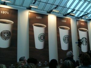
 Today (January 5, 2011) Starbucks unveiled a new logo in celebration of their 40th year anniversary. I received an email earlier this week inviting me to attend an event happening at the headquarters today. Little did I know that I would be there for the unveiling of this new logo. Already in the eight hours that have elapsed since this event, the news is full of stories and discussion of the new logo. I don’t want to duplicate what is out in the news, but rather simply talk about my experience at the headquarters and the unveiling of the new logo there.
I arrived at 10:00 am, the scheduled time, and walked out with a group to the atrium area of the Starbucks headquarters. Howard Schultz had just begun to talk about the future of Starbucks. We watched some video recounting some of his trip to Rwanda, and there were several other speakers as well. Kalen Holmes, the top HR executive, talked a little bit about “Starbucks University,” a small pilot program designed to facilitate partners’ education. I think it was Vivek Varma who talked a little bit about the Starbucks Partner Community Website.
At the Starbucks headquarters, there is a very large atrium area with a small roasting oven and large forums, roasting events, and other events are held in this room. You can see this big room in this blog post here:
Galapagos Island Coffee Roasting Event at Starbucks Headquarters
The atrium room of the headquarters today was full. All I could see was a sea of heads. As Howard spoke, for the most part I could only see his forehead and listen to him, or I could watch him on video monitors in the room. The room was full of partners. As far as I could tell, I was one of only four or five customers who had the opportunity to attend this at the headquarters. Since it looked like literally the entire corporation was in attendance, there wasn’t much room for even a handful of customers.
From the reception area to the atrium, one walks down a hallway with themed rooms. I’ve seen these rooms before (because I’ve now had a number of excursions to the SSC) but this time around the Tazo room and the SBC rooms jumped out at me. Both of those brands have exciting futures and not to be neglected in the hubbub of a new logo, I’m highlighting them here too: (See below)
As I mentioned before, the event was packed. I assume that all 3000 SSC employees were in attendance. At a distance, I recognized a number of people that I wanted to call out and say hello to, including one of my favorite MSI moderators, Erich. Unfortunately, there wasn’t an ability to spontaneously socialize because we were all glued to the announcements by Howard Schultz and other executives.


The two above pictures give you an idea of how crowded this event was. The photo labeled “Atrium is packed” faces the sequence of logos, shortly before the black drape was pulled off the latest logo.
The new logo was designed in celebration of the 40th Anniversary of Starbucks, arriving March 2011. My understanding is that the logo will begin to appear on cups and in Starbucks stores and on Starbucks items about the March time frame. I have already repeatedly heard that there will be other marketing pieces that go with this, though I can’t imagine what is meant by that. I’m guessing that we will see the words “Starbucks Coffee” appear separately somewhere on bags of coffee and /or coffee-related merchandise. The idea behind the new logo is that the brand will have increased flexibility as it expands its presence in grocery stores and offers a greater variety of products and merchandise in and outside of the Starbucks coffeehouses.
I was able to sneak a peak at a letter from Howard Schultz to partners about this change, and saw that he described the passion of Starbucks in relationship to its communities, “What defines Starbucks is our passion for our work and the values by which we work. Activities planned for April will demonstrate and build upon that passion and those values. During this month, we will invite our partners and customers to volunteer together in community events around the world, further connecting us to each other and our neighbors while reinforcing what we stand for. Serving our communities has always set Starbucks apart, and so many of you already give of yourself and of your stores in many, many ways. It will be another opportunity to celebrate this critical element of our mission. You’ll learn more about our spring plans soon, and I hope you will join me in becoming more involved.”
I love the Starbucks passion surrounding being involved in local communities, and so I wanted to share that.


After the logo was revealed, there was a short time for socializing, though not long enough. I needed badly to get back to work, and others appeared in a hurry too. Annie Young-Scrivner approached me and shook my hand sincerely and gave me a warm welcome to the headquarters. Pretty much at that moment I was thrown completely off guard unsure if I should apologize for my previous blog post where I disapproved of her shoes (an old blog post about the Shareholder’s meeting this year) or just make small talk. I opted for small talk as she seemed to be genuinely interested in meeting me, and appeared to hold no grudges. Thank god. (I believe she’s the only executive I’ve ever kind of been mean to on this blog!). I admit that as she walked away, I could help myself and I checked out her shoes. Today she was wearing cute ankle boots with heels.
Following meeting with Annie Young-Scrivner, I met up with Terry Davenport, who is the Senior Vice President of Marketing. I enjoyed talking to him about the new logo, and sort of wanted to spend more time with him, but the setting really only allowed for small chatter. This was another one of those moments where I felt like he already knew me, yet I didn’t know him. I was mildly disappointed that I didn’t get enough time to meet with my actual hostess for the event, Sally T., and at a distance I saw a PR person I wanted to talk to, but there was no way to connect with her either. Also in this whirlwind of socializing, I caught up with Michelle Gass, who is the president of SBC. I nearly pounced on her as it has been too long since I’ve seen her, and it was wonderful to meet a familiar friendly face where she knows me AND I’ve met her before. Finally, Howard wandered my direction. He said hello to me, I thanked him profusely for having invited me to the event. I am genuinely flattered at these event opportunities. With 60 million customers a week going through Starbucks’ doors, that makes me just one customer out of 60 million. Right after that, Brad Nelson came by (the official voice of the Starbucks twitter profile) and I got my picture with him:
I know that I am going to get asked over and over again what I think of the new logo. By the way, for those who haven’t seen it, there is information about the new logo here:
http://www.starbucks.com/preview
There is a part of me that is in shock. I didn’t really see this coming (though perhaps I should have), and I love the words “Starbucks Coffee” around the Siren. Having lived through one major logo change with Starbucks (in 1992), I think I can go through another. The Siren is beautiful with or without a ring of words around her. Whether Starbucks stays focused on coffee doesn’t depend upon a logo, but rather the leadership. The new logo is beautiful because our Siren is beautiful. What the future brings will simply depend on big decisions made at the headquarters, and not this logo.
Let me apologize for a large number of typos and grammar problems. Eventually I will fix them. There might be a part two to this blog post later as I am working on getting some audio from the event today but at the moment I am experiencing technical difficulties.
If you are interested in my last blog post about the logo, here’s my December blog article about finding the 1987 to 1992 logo in Starbucks stores:
My Siren Episode #2 – 1987 to 1992
Now it’s your turn to weigh in on the logo…
(Edit: I nearly forgot to mention something. When I left I was given a goody bad which include a coffee mug, a pound of Pike Place Roast, and a $10 Starbucks gift card. Since I received these gifts, the FTC requires that I disclosed that I received goods or anything of value in conjunction with this event. Consider this to be your FTC disclosure. ;))
Related posts
Sponsors
Recent Comments
- DEVIN on Compostable Straws Land in Seattle Starbucks Stores
- coffeebeanz on Why do you go to Starbucks less often? (If that’s true for you)
- Willi on You can now buy a Siren statue: $6,000
- Willi on A major revamp of your drink recipe: Testing syrup extracts and cane sugar
- Skip on Why do you go to Starbucks less often? (If that’s true for you)










I have no strong opinions about the logo. It’s clean and familiar and only an evolutionary change from the previous logo (as against the failed Gap logo redesign). If Starbucks has become iconic enough to shed the words “Starbucks Coffee” and rely on the image alone, more power to them.
So I really hate the new logo 🙁 It makes me bummed out that I even hate it.
You are in pretty good company Rachel believe me.
the idea that there is so much recognition of the logo WITHOUT the words….. I think is a misconception. I asked a few people today: what’s in the Sbux logo. These were all people who see, for one reason or other, the logo every single day….and most of them were Sbux coffee drinkers. More than half of them could only give a vague answer about what was the center of the current logo. Some had no idea, really. BUT, they all recognize, obviously, the logo as Sbux, as it is now. Without even the word STARBUCKS, I can see this new logo NOT being quite as universally recognized as Sbux corp. seems to think.
Ironically, I happen to read the little RED card that goes with the very pretty envelope for the new Adler (RED) card. One of the sentences, in a list of “we believe”s (Sbux believes) was the sentence:
“We believe minimalism is a bummer”. hmmmmmm. Ironically that’s been a word used to describe the new logo.
They’re not losing the words; the stores will still have Starbucks signage and the cups will say Starbucks, just not under the logo.
One of the things I find interesting with the new logo is how the color swap appears to have consciously gone unnoticed by so many. The siren used to be black. It was the circle around the words that was green.
Not in love! Doesn’t seem all that innovative – it’s just the center, reversed out in color. Hmm. Seems like with all the money, Starbucks could have come up with some more interesting concepts!
Mel, you took this post to a whole new level. It’s extremely informative, entertaining and just plain envy-inspiring. I love the pictures, the sound clip in the next post, and the overall level of excitement.
My post on the new logo kind of takes a completely opposite look.
(http://starbuckspassion.tumblr.com/post/2686150457/starbucks-new-logo-im-at-a-loss-for-words)
For the record, I truly like your post better than mine.
@sbuckspassion
@CD @Anthony @Jeanna @Andrew
@CD – I admit, I didn’t even immediately notice that black was gone from the logo.
@Anthony – Yes many people think the words will be gone, but I think the cups will say “Starbucks” on the seams, so I’ve been told.
@Jeanna – I can see how it might be thought of as a little plain. It’s funny, but in many ways I totally see the “Strawberry Popcorn” blog post as very tied to the “new logo” blog post. I think the real idea is that the new logo is more appropriate and flexible for the branding of all kinds of unusual products … like Strawberry popcorn. A perfect example. If Starbucks ever wanted to sell branded Strawberry Popcorn at your local QFC, this is the logo for that.
@Andrew – I hate making people jealous but it would be worse not to share this experience. It was too short. I wanted more time to talk to certain people at the headquarters.
I don’t like it Melody. 🙁 I am a fan of changing things up, but my first reaction was negative.
@Dan – I expect people to be honest. You’re not alone that a lot people don’t like it. When I first saw it, I was stunned too. I didn’t see it coming. Btw, I love your whrrl – http://whrrl.com/ – I often feel like I’m just missing you when I look at your feed. You really traverse the same places and neighborhoods that I do in Seattle. Even downtown, we’re often a block or two apart.
I HAVEthe same thought that the asst. manager at my local storehas. by getting rid of the name and letting the siren free, it has freed up the brand. she felt that the siren in side the ring name locked itup. The brand is now free to go wherever it wants to now.
…
The new logo of our starbucks is clean and simply.
I need a time to adjust, finally I will like the new logo.
But I will miss the letter “Starbucks Coffee” around the Siren.
Because, Starbucks is a ‘Coffee’ Company.
Just my thinking of the new logo
from S.Korea.
bye!
I like your thinking Libero79. I miss the words “Starbucks coffee” but I like the clean and simple new logo too.
@tim_sandor – Well that is exactly the company’s stated reason why to have a new logo: More flexibility. I am pretty emotionally attached to the image of the Siren, so I quickly liked this logo too.
I’m positive toward the new logo. I think it maintains 1) the siren 2) the circular design 3) Starbucks green — all three are crucial to the Starbucks logo, whether or not the name of the company encircles the siren. If you were to look at all of the copyright infringement suits Starbucks has launched (and won) as well as generic pictograms of coffee cups, they all resemble the Starbucks logo (much the way mp3 pictograms tend to resemble the iPod, smartphones tend to resemble BlackBerrys, etc.).
I’m not sure if I necessarily agree with Howard’s comments about moving the new logo direction being emblematic of a shift from the core of quality coffee. On this matter, it will be an uphill battle to rein in brand dilution while not sacrificing the core product, anymore than Nike has struggled to become a premier global equipment brand for football(soccer). And to that matter, the swoosh has global ubiquitousness. Starbucks has grand dreams of ice cream ventures and the likes, but will face massive backlash if it strays too far. The new logo will then represent the downfall of Starbucks as a quality brand.
Where the new logo will succeed is by better representing Starbucks in global, non-English speaking markets. As the Asian markets are heavily picking up their coffee intake (over tea), the ability to reach out to them with a sleeker logo will be all the more crucial. The shift to pure imagery will help Starbucks out in that brand recognition.
All in all, it seems to be a positive move in various regards, but as recently seen with Gap (though Gap’s rebrand was a different, crowd-sourced case), this momentous event should be regarded cautiously over the next couple of years.
@Spencer – I’ve been meaning to come back to this. I so wish I had recorded the first half of Howard speaking at the event, but I didn’t hit the right buttons on my camera. He said that the “guardrails” on new products would still be judging the new products by the quality of the cup of coffee. I am with you, and the longer I think about the new logo, the more excitement it holds for me. IF Starbucks strays very far from coffee there might not be massive backlash over the long-term: Look at the million and one threads on MSI asking for more ice cream, and more sugary-beverage like products. There may be broad acceptanc of Starbucks as a beverage and dessert company. The challenge is that there will be coffee can easily get sort of forgotten in the process. I’ve joked, but it’s true, over time there might be people who see the logo in the grocery store and say, “Remember back when when Starbucks sold coffee?” Thank goodness, I don’t think we’re anywhere near that yet.
@Spencer – Do you by chance have a recording of the first part of Howard speaking? I think there is a way for partners to stream a recording of the event from 1-5-11? And in case it wasn’t obvious by my response, I liked your comment a lot!
Melody your comment to Sepencer is an interesting one. I have mixed feelings about where I want to see SB go. I totally understand about moving away from coffee and what happens as a result of that, however, I also think they need to expand. I guess the questions remain as to how to expand and not lose the coffee aspect of the business.
Melody– Sadly I’m not sure where Howard’s speech is located online. The only thing I got to see was what’s on the website (I was sitting in my Starbucks when Cory’s twitpic popped up). You’ve got more on it than do I.
We live in a society where reactions tend to be snap, rather than measured, particularly when it comes to news like this. I edited and crossposted my comment to my own blog (with links). As I said before, the Gap rebrand was met with almost instantaneous disdain. However, the Gap rebrand fell on its sword because it crowdsourced the new redesign to what I would envision was brand evangelists. Brand evangelists don’t make up the bulk of sales though–the masses do. IMHO, the new logo redesign speaks to the traditional cues of the Starbucks brand for recognizability among evangelists and the masses alike, while modernizing ever so slightly.
The second part of the rebrand has to deal with the actual mission of the brand. If the company can faithfully retain its core mission (which the Howard video seems to emphasize), then this could definitely bring the company more success. However, if the mission is to slap a new logo onto coffee products and then start slapping it onto non-coffee products (Tazo, etc. aside — though even that’s arguable), then the rebrand may be considered a failure. But the fact is, Starbucks is pushing a commodity — if it wants to maintain its relevancy, it needs to, like you/Howard said, stay within the “guardrails” of its next brand mission (beverage and dessert?) and not overexpand too fast.
In spite of the backlash suggested in this article, there are lots of cases of companies who have used rebrands to their advantages and Starbucks has every possibility of continuing those cases (P.S., the irony of that article is it contradicts exactly what happened in the instance of Gap). Additionally, there is tons and tons of academic research (as I now get to follow) on all the various dimensions of brands, ranging from colors to shapes, sizes, personalities, loyalty, equity, the list goes on… I would be hard-pressed to think a company the size and scope of Starbucks would continue with a rebrand without consulting the many marketing academic researchers who deal with these issues.
Time will tell how this turns out, sooner than will comments like “Hate the new logo, enough to stop drinking it all together” (what does hating logo have to do with liking a good cup of coffee?).
Maybe I read it over anywhere…but do I understand it right, that ONLY NEW STORES will get the new logo at their doors?
Or will ALL EXISTING stores’ logos be replaced?
I can’t imagine that with thousands of stores…
This is a funny critique of the new, more simplistic logo: http://adweek.blogs.com/adfreak/2011/01/starbucks-logo-timeline-of-future-redesigns.html
finally I will like the new logo