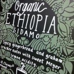
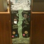
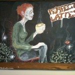
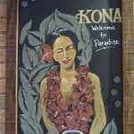
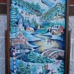
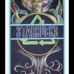
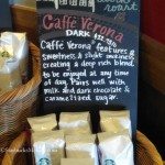
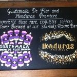
On February 19, 2012, I announced the second StarbucksMelody.com contest to find barista-created art on chalkboards on display inside Starbucks stores. It has taken me a while to go through the emails, but here we have the entries and winners. At the end of this blog article are a few of the “non qualified” entries that were submitted to me. Unfortunately, every single time I do a contest (it almost doesn’t matter what the contest is) I will always get a number of entries that didn’t quite comport with the stated rules, and some of those with emails acknowledging such, and some not. Having said that, I am eternally thankful for the great participation in this contest! I know it wasn’t easy to find chalkboard art.
So here is the art that all of you – my readers – sent me. Thank you!
It was extremely tough to look through the above 33 images and make a decision. I really appreciate every single one of the above chalkboards. I still maintain that the chalkboards in a Starbucks store represent one of the few ways that a store gets to put some stamp of their own personality in the store. Even if I look at something and think, ‘That’s odd. I don’t get it‘ I still appreciate seeing it.
Judging from the emails I received, mostly partners responded to my call for chalk art. There certainly were a few customer entries too, (the contest was open to both) but seeing that overwhelmingly partners emailed me, I did think for a moment that there are a lot more people who could leave blog comments who don’t! LOL.
Here are the three winners:
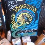
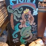
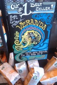
1) Veranda Basket Sign – Honolulu, Hawaii
The Veranda sign has so much charm. The Siren looks great with a cup of coffee in her hand. I love all the blue and yellow colors which look to me like it would fit perfectly in Hawaii. And it’s very ornate, with beautiful lettering too. Thank you to Honolulu, Hawaii for sending this in!
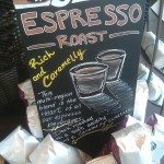
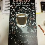
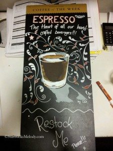
2) Espresso Sign – Kingston Upon Thames, London
This quite an amazing shot of espresso! There is something about this sign that makes me want to grab the shot glass of espresso and take a sip. It looks so very real. And I like the ornate work surrounding the shot glass.
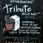
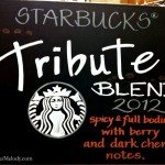
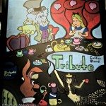
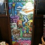
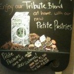
3) Tribute Blend – Create Community Change – Michigan
This is so beautiful that I am almost at a complete loss for words. I love the community service component tied to Tribute Blend. And the artwork here is incredible. The artist here clearly gifted!
******************************
Thank you everyone for sending in your pictures. I can’t say thank you enough. PLEASE do not hesitate to email me about getting your $50 Starbucks gift card in the mail. If for any reason you think I need your postal address, or you just want to confirm your mailing info, email me at Melody at StarbucksMelody dot com.
If you like partner-created art, I have a category of it here. (You may have to dig a bit through that category.)
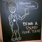
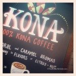
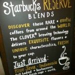
Below are entries that were “unqualified” for one reason or another. I had indicated that to be eligible to win, the sign had to have been on display within the past 90 days. For that reason, when I saw art for Anniversary Blend, and other certain coffees, it was automatically disqualified and overwhelmingly, the art work below was outside of 90 days. However, I only listed certain number of countries as eligible, and so the one entry below from Poland was not eligible.
I guess at the rate I am doing this contest, we’ll be repeating this again in 2014! It’s an overwhelming contest to put together. By the way, for the winners, I’m sending the prize on the limited edition Pike Place store gift card. I’ve heard those gift cards are no longer produced, and what’s left in the store is it. Hang on to that card! It is collectible.
Other entries:
Related posts
29 Comments
Leave a Reply Cancel reply
You must be logged in to post a comment.
Sponsors
Recent Comments
- DEVIN on Compostable Straws Land in Seattle Starbucks Stores
- coffeebeanz on Why do you go to Starbucks less often? (If that’s true for you)
- Willi on You can now buy a Siren statue: $6,000
- Willi on A major revamp of your drink recipe: Testing syrup extracts and cane sugar
- Skip on Why do you go to Starbucks less often? (If that’s true for you)





For as impossible as it was for me to find any entries for the contest, I’m glad to see there is art still out there! Beautiful! Congratulations to the winners!! 🙂
Wow. Those are phenomenal!
WoW!
I too am impressed with the chalkart and am amazed at how beautiful they all are, but my fav is the #3 one. I wish stores around here kept this up. Thanks everyone for sending it in to Melody.
Great signs made by really talented baristas!
some really great stuff! I really think the St Louis one was very cool…..
Melody,
I so wanted to participate in this, I would have liked to give my local SB artists some recognition. But the 2 I frequent didn’t have good art. And I didn’t get a chance to get out a view some from other locations. I’ll keep an eye out for the next contest and see about next time.
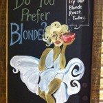
These are amazing! My personal favorite was Marilyn. I love the reference to blonde as her and the coffee. And the art is nice.
I think you chose the right one. The Siren represents SB so it is cool how they have her representing in the board.
~Allie
Thanks for sponsoring another great chalkboard art contest. It’s nice to see the different art work centered around the common theme of Starbucks. 🙂
I’m glad so much art was submitted! I tried to find some in my area but all I saw were stencils and the like. The winners you picked are absolutely gorgeous! I love to see that there is some serious talent out there getting to express themselves via this awesome chalkboard art! I love when you do these contests. They’re so fun!
Melody!
Thanks so much for having this contest!
Seeing your post this morning while sipping my coffee & checking facebook made my day! Thanks for picking my siren! 🙂
Looking at all the other entries has been a treat too. What awesome styles! I especially love the way different baristas do their lettering. That’s always the hard part for me; coming up with lettering styles that aren’t just my standard handwriting, so I’m always taking notes on fonts! lol
Mahalo! Suzi.
Hi Melody! I saw your tweet and just wanted to let you know I enjoy reading your blog. Happy Monday!
Wow! That art is truly spectacular! It puts my own art skills to shame…
They are all great! Seems there is a whole lot of talent out there. Congrats to the winners.
I just want to say thank you for all the great comments! It’s nice to know that so many people appreciate the hard work and talent of these partners.
Awesome! Thanks for sharing and I loved the Marylin one too and it is HARD to pick a favorite! I pinned several to my Starbucks Pinterest board.
http://pinterest.com/trolsgirl/starbucks-addict/
I agree with your selection. For a vibrant appearance, number three has it; for a classy perception, I go for number two; Number one has both elements.
Those are all so amazing! The Special Reserve signs are especially breath taking! And I noticed lots of Hawaii & European partners sent you images. I love that our community is so global. 🙂
@CamSpi – I just looked at my analytics – In the past 30 days I had visitors to this blog from 136 countries. Overwhelmingly though, my visitors come from the US. Canada is #2, and the UK is #3, and then the Philippines is #4. Actually, what I find interesting is for several months now, overwhelmingly by a large number, readers of this blog are from California. Washington is #2, then #3 is New York, and #4 is Texas. That was good to go look at that!
And I am glad you liked all this art too!!! 🙂
Great artwork. I’d love to see more of this kind of thing in all stores.
Melody, I’d love it if you made this contest an annual thing! It’s so nice to see all the gorgeous chalkboard art here. Especially love all the fonts and the ones using various colors 😀
Such beautiful artwork!
Seeing all the artwork makes me feel proud to work with a company filled with creativity. Some of the partners out there are simply amazing. Thank you for highlighting this area of Starbucks!
Is it strange that when viewing the picture from my own store that I’m really looking at the back of the line to see what things I might find out of place? Didn’t see anything not Eco-sure friendly. lol Great job to all in their artistic flair.
They are all terrific! I love the Alice in Wonderland sign, I’m a sucker for anything Alice related:)
P.S. the SB keychain arrived in my mailbox today–love it!
Fantastic! I love this. I agree with Kaori – this should be a yearly contest (or twice a year?).
Such great talent!
Thanks for the key chain. I got mine in today with your lovely handwritten note. Great job on the chalkboard art contest.
So, so, so cool! I love ’em! 🙂
These are absolutely exceptional!
There is a partner at my local SB that is a great artist- she did some artwork for the tips jar and yesterday I said to the SM the partner should do some chalk art. The partner was there and would love to do it. The SM’s reaction was mixed. Laughed and sort of said yes, but I felt he was just being nice. I joked with him that it would give some spunk to the store. Sort of sad.