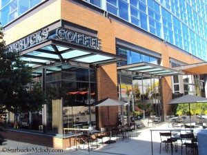
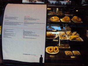
 The Starbucks at the corner of Terry and Republican Streets, in the South Lake Union neighborhood of Seattle, IS an amazingly photogenic store. It also just recently re-launched as a beer and wine (Evenings) location. Previously, I wrote an article about the unique food items available at an Evenings Starbucks. In addition, the Evenings Starbucks stores have Riedel wine glasses for sale, made especially for Starbucks in partnership with Riedel.
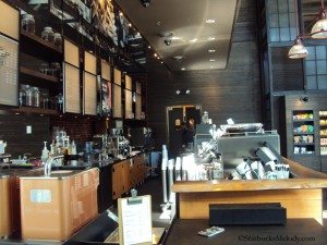
On Sunday, August 5, 2012, I dropped by this store, just because I like it so much. Mostly, I wanted to be inside some nice air conditioning. When I arrived, the store was only mildly busy, with a few customers milling about, purchasing beverages and food. At one point the store emptied out. I was surprised. There was a small block of time where I was literally the only customer in the store. I just had to take photos. It’s a rare opportunity for me to get a store all to myself. There were only two partners working at that moment, and they’re not in many of the photos below, so these photos oddly look like I’m in a totally empty store!
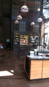
It was a very bright and sunny day too, so I love how the sunlight is pouring into the store. I just couldn’t resist the opportunity to feature this store one more time. As a reminder, the Terry and Republican Starbucks opened brand new on January 2, 2012:
Starbucks store #15407
442 Terry Avenue North
Seattle, WA
(206) 467 4945
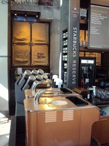
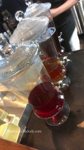
By the way, one of the photos below was taken on August 2, 2012: I went to an event for the launch of new Starbucks food, and I noticed that this Starbucks had some unusual iced tea containers that day. It seems as though on special occasions, this store uses their fancy iced tea containers! Look for that photo below. Also, I don’t think I took a picture of just the condiment area, but the store always has real silverware available at the condiment area. The store now has two Clover brewers, and when it first opened, there was only one Clover.
I don’t know if any of my readers are following Winter’s (another customer) personal adventure to visit every single Starbucks in the world, but I noticed on his website that he visited this store on March 1, 2012. I like the photo he took of the outside logo.
Enjoy the photos!
Related posts
24 Comments
Leave a Reply Cancel reply
You must be logged in to post a comment.
Sponsors
Recent Comments
- DEVIN on Compostable Straws Land in Seattle Starbucks Stores
- coffeebeanz on Why do you go to Starbucks less often? (If that’s true for you)
- Willi on You can now buy a Siren statue: $6,000
- Willi on A major revamp of your drink recipe: Testing syrup extracts and cane sugar
- Skip on Why do you go to Starbucks less often? (If that’s true for you)


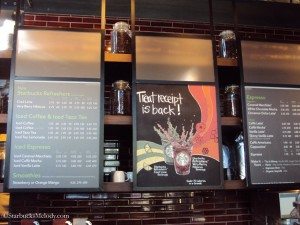
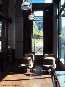
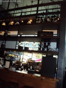
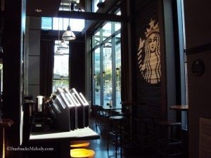
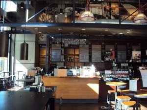
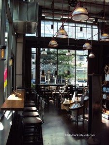
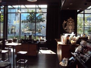
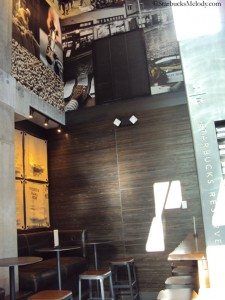


This has got to be one of the nicest locations you have covered and highlighted IMO. I rarely hang out for hours at a Starbucks, but I could see myself getting really comfortable and just chilling in a location like this. Is that Siren that appears on the wall actually on a wall? In one photo it looks like it could be made of a 2 tone wood mini blind, but maybe that’s just the way it appears in the photo. Nice!
@Chgo – Thanks. When I visit, I always head straight to the booth comfy seating at the very back of the store. It’s the gem of the store. Comfy and with a view of every thing that is happening inside the store. The big comfy seats near the front windows are popular.
The Siren wall is made from bicycle tires, as I recall. There is one similar to it in Portland’s “Brewery Blocks” Starbucks.
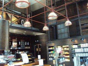
One thing though – The lights … those are my LEAST favorite fixtures that Starbucks uses. I really think they look just like lighting in the metro bus tunnel underneath this city – Standing in the Pioneer Square bus tunnel station, there have been many times I’ve thought the lights look just like Starbucks. That almost the only thing I notice anymore. In any event, I think those light look fine hanging from tall ceilings, but they don’t work in a store like Denise’s neighborhood store, which got the same lights, as I recall.
The most amazing Starbucks lights are these that actually say “Fresh Roasted Coffee” on them!!
http://www.starbucksmelody.com/2011/07/10/first-and-pike-starbucks-a-unique-and-gorgeous-clover-store/
http://starbucksmelody.com/wordpress/wp-content/uploads/2011/07/2-3-First-and-Pike-Starbucks-lights.jpg
Those are, by far, the most seldom used light fixtures in Starbucks in the array of new designs. I should have discussed the lights in the original article. Denise’s store would look 110% with the First and Pike lights.
I assume you are talking about the big glass hanging lights? Unfortunately, that kind of lighting is very popular in areas with high ceilings. It may not be the best choice aesthetically, but does work well in that kind of room as far as lighting goes. It’s still by far one of the nicest stores I have ever seen.
That’s a beautiful store.
Absolutely, this is an amazing store. I’m on my Kindle sorry this is short and sloppy. I’ve thought about putting together a blog post on what makes a gorgeous Starbucks. It’s like store design has a bazillion puzzle pieces but how to put them together? I think these corner stores with high ceilings have an advantage immediately – natural light pouring in everywhere. But ‘course store design has to make the most of it.
Melody I actually cannot decide which pic I like the most as they all are so wonderful. Were you able to chat with the partners when you were the only customer? I assume this new concept store is being well received by folks. I wish this design would travel to stores near here.
Hi Purple1 – When I was visiting, one of the partners working was a young guy named Anton. He is really really terrific. He’s extremely smart. He’s a coffee master. He’s kind and easy going. Just an absolute great guy. I always love running into him. I didn’t know the other partner well. I don’t know the partners all that well. I normally only visit that store on weekends. And, I hear that the store is quiet on weekends compared to during the week. A lot of the customer base works in nearby office buildings with many Amazon.com corporate employees.
These ARE the lights that we got, eventually, with our ‘remodel’…over the computer table. They lowered the ceiling over just that part and put these up. I didn’t like them so much at first, but they do serve the purpose..and we did have to have some kind of pendant lights over that area. Considering the choices I have to “like” in our ‘remodel’, this really doesn’t mean much. In any case, yes, we have them.
I can’t remember if this has come up for discussion but it seems to me that store design is so crucial to the ambiance and culture in a store. Has corporate SB ever asked opinions of customers re what they feel their store should look like? Gosh some of spend so much time in the stores you would think we would know what works. I have walked out of a few stores because of the design. I certainly see regional people hovering in stores due to have remodels but never see them asking customers for input.
When you say ambiance and culture, are you referring to the ambiance that reflects the culture of the customers in the area, or the one that reflects the stereotypical Starbucks culture? It seems they are more interested in the latter of the two. Here in Chicago, the only stores that I have ever seen that reflected the culture of the area or the local population, were those that were associated with Magic Johnson.
Chgo. I guess I am referring to a little bit of both, however, I do strongly believe that SB stores should have some of the ambiance and culture of the community it serves. Melody has written some store reviews where the new designs seem to reflect the surrounding areas and I so appreciate that. I just think that in some ways SB has missed the mark in not involving customers in sharing their opinions about how a store should look, etc. Aren’t we the customers the ones sitting in the store?
@Purple1 – I think the issue is money. Each of these ‘major remodels’ and the flagship new store openings cost a LOT of money. One way to save money is to have two or three regular designs that you draw from. There is only a small amount of customization outside of that. Sometimes it is in the wall design – Like the School Street Starbucks in Boston which is on the Freedom Trail walk, and has Boston history on its walls. And sometimes it’s sourcing from local area materials. I agree that it’s nice to have something about each new store that is unique and local – balancing that with the cost of a new store is the issue.
The Brewery Blocks (Portland, OR) Starbucks has that bike tire wall – as hat tip to the area’s many bicyclists. And the GreenLake Starbucks in Seattle has a stroller parking area outside, which makes sense because that store has way more stroller traffic than probably any other store in Seattle due to its location near Green Lake.
And the Ballard Starbucks has that outside marquee that is drawn from some historical signage on Market Street.
By the way, I think the Terry and Republican store is beautiful. I wouldn’t say that it reflects anything particularly Seattle.
I really do need to write a whole blog post just as commentary on store design, but I jut have to find the time to sit down and write that … right now, I am dashing out the door to work.
Well, re: money and the design of a remodel or new store…..I know that’s a factor but I also know, from my own experience, Sbux spent a lot of WASTED money on our ‘remodel’ when they 1) didn’t get village permits before doing half the construction so then had to shut down that process midstream
2)used cheap Mexican pine for most of the STUPIDly arranged (thrown in) tables and chairs and so they were SPLITTING within the first couple days. (I did hear from some corp people that Sbux would not be ‘using this particular wood’ again.) Yet, here we sit….so to speak.
3)Put only 2 little low metal framed chairs in, originally, to be the “comfy chairs”…..something like a lawn chair. So many people complained that the dm and sm did finally get us 2 leather chairs with arms (which many people need) BUT Sbux won’t pay for a small table to put between them so someone has just pulled over one of the regular sz tables and put between the chairs..someone who is my height (5’4”) has to actually reach up a bit to put a drink on the table. It’s just so stupid.
4)nothing got better. nothing. OK, we got paint…but they took AWAY beautiful coffee design prints off the walls, replaced with not-so-good abstractions.
5)I take that back…they did lower the pick up area at the bar…..that’s better.
My point is (if anyone has even read this far) is that they WASTED A LOT OF MONEY. oh wait, one more big waste: Sbux gave the store these big BLACK metal planters for outside, which got used for trash for most of the spring, early summer. Finally got planted…which is very pretty. But, anyone who knows anything about flowers would not use BLACK metal. Then followed the drought, the 100+ degree days etc. I suppose the good 🙁 thing is they match, the black HOT metal of the new tables and chairs outside, which of course are scalding hot.
This is a good store. It keeps a big loyal base because of the very good sm, dm, rdm and partners!!! They’re all good! were it not for them, I’d never go to this place again.
As DadC….would say (how are you DadC?)….’sorry the rant’.
First, Melody I would enjoy a blog post on store design. Your comments are appreciated. Denise R so understand what you are saying and wish SB would read your comments and take heed. Going back to one of my points- Would some of your issues with the remodel of your store have happened if perhaps SB took the time to ask you and some of the other regulars what they would like to see in their store? I understand the issue of cost, but isn’t one of the goals of SB to make customers feel welcomed and enjoy their stay?
Just want to add my vote for a blog post on store design. I love seeing pictures of these beautiful stores.
I think the lights suit the industrial style design. I love the Terry and Republican Starbucks, it has such a welcoming feel. My other favourites are 5th and Union, and The Lodge in Bellevue (the foyer with fireplace!).
I was actually told this was the original Starbucks, until I saw a Biography episode on the company and realized it wasn’t at a corner 🙁
I can understand why you love this store, it really is beautiful! The high ceilings are great. I don’t know why but from your photos, the area behind the counter reminds me of a lab. Like a very classy lab 😀
One thing I noticed going through the photos – Aren’t those clovers a different color than the ones in other stores? Or is it just me? Is that a new design maybe?
I love the store! The corner with the huge glass corner front is great! I agree that more natural light in the store makes it just a little better, than the interior design alone.
Hi Nathan! Yes, they are a different color. The Clover brewers are made in a couple of different colors, and the beautiful coppery color shown above is a little less common. I think there is black, and silver too. The Bellingham Starbucks article on this blog, and Madison Park articles show off copper color Clovers, but most are black I think.
That’s it. I refuse to look at the gorgeous Starbucks you get to visit up there and I get the tiny rinky dink one down the street from me. BUT our baristas rock. Michele always remembers my drink. (I think she has a crush on my hubby, but who cares I get good coffee.)
~Allie
I was at this store yesterday, and I am reminded that in terms of store design, it’s one of the most unique and beautiful in Seattle. Please “like” this store too. 🙂
Nice to revisit this store too Melody. Just this am I was chatting with the SM at my local store about the problems with some things in the store – related to design and hardware – that seemed to have surfaced after remodeling. Some stuff has always been there and other stuff new. I just am amazed how these things do not seem to be important in terms of getting fixed right the first time. Design and ambiance are so important.