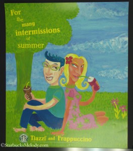
 I found this Tiazzi Starbucks signage on eBay, and gladly snatched it up. I previously wrote at length about the history of Tiazzi blended beverages and Starbucks, so I won’t repeat that here. If you want the Tiazzi history lesson, take a look at this past article:
This Tiazzi poster is so interesting. It is again (like the first one featured in the link above) somewhat impressionistic-ally stylized. The male figure in the poster appears to be holding some sort of Mocha Frappuccino. Notice that his straw is not green! Well, it appears to be an off shade of green. The female figure is looking at him with a pretty wild expression in her eyes! I assume she is holding some kind of Tiazzi blended beverage. And I like the catch phrase, “For the many intermissions of summer.”
As I have said many times on this site, old Starbucks posters are great Starbucks history lessons, and I like being able to feature them here. Hope you enjoyed this look back at Starbucks marketing of yesteryear too.
Related posts
4 Comments
Leave a Reply Cancel reply
You must be logged in to post a comment.
Sponsors
Recent Comments
- DEVIN on Compostable Straws Land in Seattle Starbucks Stores
- coffeebeanz on Why do you go to Starbucks less often? (If that’s true for you)
- Willi on You can now buy a Siren statue: $6,000
- Willi on A major revamp of your drink recipe: Testing syrup extracts and cane sugar
- Skip on Why do you go to Starbucks less often? (If that’s true for you)


What happened to the posters of yesteryear? They tell such a story! To me the man’s straw is sort of yellow? I like the colors.
I really remember those days of Sbux! compared to then, I almost feel they’re (Sbux) just kind of ‘giving up’ on those little ‘connections’….the 3rd place etc.
tazoberry ‘n cream……I always got the berry (or red) one in the late afternoon. I’d love to see the return of that drink….. they could skip some of these other new things. (imho)
@Denise and @Purple1 – I definitely think that when Starbucks was smaller, they felt like they had more of a license to be daring, bold, and creative. Now, marketing is spread across 12,000 stores. Larger potential to offend! I honestly think that’s the trend of most businesses as they get really big – They work harder to have non-offensive marketing … that usually means it’s a little more dull. The old posters in the “history lessons” of this blog are really different than now.
And I don’t think current Starbucks marketers have read “Tribal Knowledge” by John Moore. That is all about Starbucks and how it markets, and what it values in the messages it sends. But’s it’s an older book, and I am not so sure that the ideals represented in it represent current Starbucks marketing.
Hey, what a fun poster! I miss lots of things that have come and gone at Starbucks, and funky-fresh marketing is one of those things, for sure. On the other hand, there are about ten stores I go to on a pretty regular basis, and that makes me kinda glad marketing materials with that much personality are a thing of the past. If I walked into my neighborhood store, I would see that poster, think it charming, and maybe buy myself a Tiazzi. If I went to a different store the next day and saw the same quirky poster, it would quickly stop losing the feeling of marketing with “character” and by store four or five it would probably be annoying. In a world with so many stores, I’m glad marketing materials are so stripped down that, most of the time at least, they just blend in and add flavor to the store without beckoning for one’s attention…