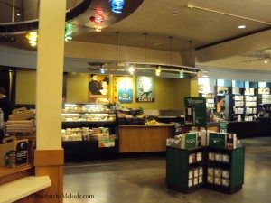
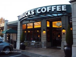
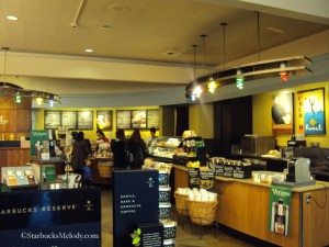
I recently found a Starbucks where time has stood still. 1995 is still well and alive. It’s the Bellevue Starbucks which I wrote about previously in an article about names on cups. It is a store with dated light fixtures, and an amazing team of partners. I was very impressed with the passion in the store. I thought — and of course this is only my opinion; taste is subjective — that some of the store’s design is now an eyesore in light of the many beautifully remodeled Starbucks stores in the Seattle area.
I thought that this store was so remarkably in need of a remodel that I should write an article about it. This is your “before” article in what will hopefully be a two-part series. I’ve heard that this store is slated to have its major remodel in 2013. For the Seattle area of Starbucks stores, this is an absolute one of a kind in its design. The major remodels have already been done on so many stores, such as the Queen Anne Starbucks, University Village; and new stores like Terry and Republican absolutely shine.
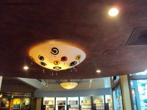
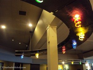
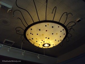
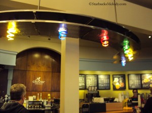
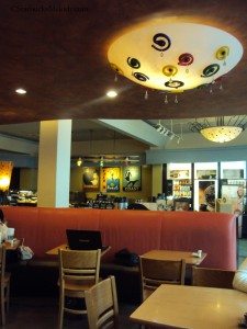
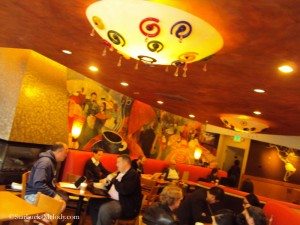
Here are the lights. They look like Jolly Ranchers gone bad (in my opinion). This is what stands out the most to me about this store:
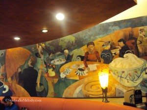
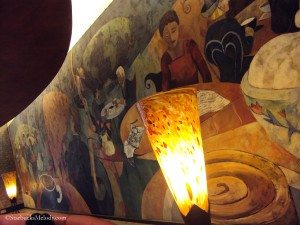
Interestingly, Audra, the store manager, mentioned to me that she has had customers tell her how much they love the ceiling lights in this store. In my humble opinion, they look like they’ve been untouched since 1995. I’ll be blunt: Those light fixtures are just ugly, in my opinion (taste is subjective!). This store has been in this location for a very long time, given that it was one of the first few Starbucks ever. The mural on the wall is dated from 1995, which suggests that this Starbucks had a major remodel in 1995. Actually, I do kind of like this mural still:
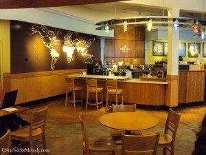
Right now the seating is mostly on one half of the store. It’s a very inefficient use of space. This store is almost always packed. In 2008, this Starbucks added a Clover brewer, and a map of coffee growing regions was added to one wall. I actually really like this touch!
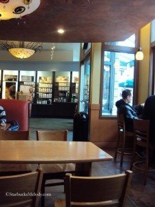
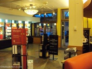
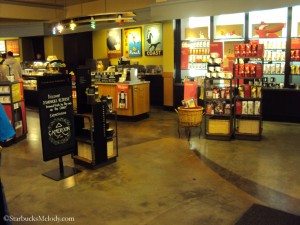
I will admit that there aspects to this store that are not terrible. However, I know that when the Starbucks store design team gets their hands on this space, it will look much better. I don’t know if it’s apparent from these photos, but the store has a very large footprint. The current design doesn’t maximize the possible seating in the store. The area in front of the merchandise wall is open and has no seating at all.
This is the same store where I wrote an article talking about baristas using customers’ names on cups. I want to make it clear that my disparaging remarks about the store’s ceiling lights have nothing to do with the great people who work in this store! And as I always say, at the end of the day, it doesn’t matter what the store looks like. It’s the people in it that make it come to life.
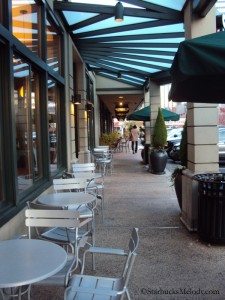
I’ll wind up my “before” article for this store with a few more photos. I hope that some day next year, I will be writing that “after” article.
What do you think?
Related posts
32 Comments
Leave a Reply Cancel reply
You must be logged in to post a comment.
Sponsors
Recent Comments
- DEVIN on Compostable Straws Land in Seattle Starbucks Stores
- coffeebeanz on Why do you go to Starbucks less often? (If that’s true for you)
- Willi on You can now buy a Siren statue: $6,000
- Willi on A major revamp of your drink recipe: Testing syrup extracts and cane sugar
- Skip on Why do you go to Starbucks less often? (If that’s true for you)





I wouldn’t care about the look, but the barista’s and the end result – good Starbucks coffee!
@Sue – I totally agree with you. I was trying to make it very clear that the team here is great. The store is so outdated that it is remarkable, and furthermore, I did that there was an opportunity for a really dramatic “before” and “after” store article, since this store will get a major remodel.
As long as it’s not too shabby/old I can handle a little outdated look. The light fixtures are dated though… I don’t know as long the coffee is good-I don’t mind! I have my favorites here in FW. I love my Dashpoint SB! On the weekends (maybe during the week too-don’t know) the older guys bring out their antique old cars so you know the regulars are there when you see those gorgeous cars!
My hometown back in MO had one SB and that was inside a Target! Then it got a stand alone and it was smaller then the space at Target!!! I remember my first SB coffee at the standalone location- it took 20 mins!!! Then I moved out here and SBs and independents were EVERYWHERE! I still joke that everything in Washington is near a SB and Teriyaki restaurant… at least now I know it doesn’t take 20 mins to get a coffee… lol
Melody I actually like the lighting and the mural. How high is the ceiling? My local SB is due for a remodel but am not sure exactly when. I agree that it is staff that makes the SB, but even when there are great partners if the store looks dated or there is not enough space it makes being in there depressing.
I dunno… Some of the remodels have been odd. One near me now looks more like a Caribou Coffee inside. Regarding the pics above, I like the concrete flooring and wall sconces.
@DaveZ – Man I was looking so intently at those Jolly Rancher lights, that I didn’t notice the flooring. You’re right – the flooring is a keeper. It reminds me, I have heard partners complain about floors that are impossible to keep clean because of tiling. The concrete floors here are probably easy to keep looking clean.
@Purple1 – Good question – I should have asked how high the ceilings are. I’ll put that on my list of questions when there is an “after” article. 😉
I like the retro look and I love concrete floors. 😉
There are signs of a fairly recent remodel around the Clover, but certainly a mix of old and new. The tables and chairs, for instance are dated but look to be in good repair. A quality of a great Starbucks is when, as is the case in this store, the overall experience outshines any less-awesome things (ie spills on the condiment bar, wait time, funky old lights).
@Sandra @Charles H – Okay, keep the concrete floors and Clover area, and remodel the rest to look like a Terry and Republican, and make it an “Evenings” store! 🙂
Living in Bellevue for more than 17 years, I love that store. I usually visit the store on Friday for the Clover brew. It is a busy store and doing any major remodeling would be inconvenient even there are 2 Starbucks store across the street.
Speaking of remodeling, I feel the Belltown store on 1st Ave is old as well.
Hi Melody,
I totally agree with you and feel the same way about my store. It is 15 years old and has teal cupboards. We will get a remodel soon but I still don’t know what will get done. Recently a store down the street got a beautiful overhaul and now i feel like an ugly duckling. I know that our time will come soon. It will be nice to be freshened up. But I also feel like the partners in the store make a bigger impact than the style.
That is what most of the stores near me look like, variations but similar nothing really updated or fancy. I would like to travel to the Original Starbucks location one day.
@Becca – Hopefully soon you’ll get your remodel!
@Jennifer-Marie – I confess, I live in Seattle and so this blog reflects kinds my experiences which might be different than elsewhere. This store is really unique because it’s like the last in the area not to have had a major remodel yet. I can’t wait for my “after” article someday! 😉
By the way, I hope you get to 1912 Pike Place soon – I have written about it several times and recommend this category here:
http://www.starbucksmelody.com/category/1912-pike-place/
I think I am due for another 1912 Pike Place article. Thank you for the good idea!
I actually really like that mural on the wall, but from what I see in the pictures, there is a lot of dead space that could be used for seating (since you mentioned the place is always packed). I would love to see Starbucks try a more modern feel to the store, especially with all that space to work with!
@f – I agree! That’s what I meant by the inefficient use of space.
I think you could do a lot with this space. If you were willing to completely gut it. From my perspective, there seems to be a lot of wasted space in the entry areas and a lot of seating space that probably isn’t used effectively.
If I were to put on my interior design or architect’s hat, I would start with going with a nice modern, woody feel…like the Starbucks I used to go to on 96th and Lexington in NYC. Instead of banquets, maybe go with wooden banquets. Maybe an elevated bar near the open windows so people can look out.
I’d also update the shelving and create a different pathway to the registers because it looks like the area around the baristas could get congested with people both coming up the place their orders and also people that are waiting to receive their orders.
I think they also should commission a local artist to create some kind of art installation, painting or etc instead of those paintings and the terrible light fixtures.
And, if you were willing to rip out the counter and bar, you could have a terrible amount of fun.
Dave I really like what you would do with the space. In fact, you bring up an interesting idea. I know SB has a design team and a certain style for their stores but wouldn’t it be nice if they had a contest asking for designs for a store and then letting the winner be commissioned to design the store?
What would I do with the space? I would move it into my neighborhood just the way it is. We need one really bad by me in my zip code. I drive a good distance everytime I go to Starbucks. I’ll take the tacky lighting, the mural, I’ll take it all. Beggars can’t be choosers. There better be a Clover machine with it. I have just the right vacant space to put it in too.
@Chgo. I just totally laughed out loud. Loved your comment.
I’m serious Melody. The closest store is in a cramped and shady area. The next closest store is the one I used to frequent, but after the partners park, there are no spots left for customers. There is no street parking at that store. So I go to the Clover store you visited with Denise. That’s almost 12 miles round trip. I’m liking those big ceiling lights with the squiggly things on them. I will pretend it’s designed by Chihuly.
I’ll agree that this store could use its space much more efficiently, but I like it’s uniqueness. I used to live in the area and popped in on occasion. (Terrible parking!) My regular store in Portland is currently going through a remodel and it’s lost all its charm. They do the remodels at night so it was sort of fun to come in the each day to see what was different. Now that it’s about done, it looks cookie cutter with a horrible choice of furniture for the older clientele that frequents the store. You should see it, I’ve never seen furniture rearranged so much in my life! The result is an obstacle course with horrible traffic flow. It’s only a matter of time until someone falls and for what? So the store can now look like all the others. It’s a shame.
@Darla: I know just what you mean. Apparently what was a huge ugly mess done as a ‘remodel’ at my regular store is not so uncommon. There’s nothing (nothing) comfortable about it plus it’s ugly (I’ve heard of no one who likes it in any way), and it’s cheap furniture, with the Mexican pine they used for the tables and chairs splitting down the middle every day. It literally does look like someone just threw the furniture out there, a crowded, ugly dangerous mess.
This is the Starbucks I go to every morning. They did have a partial remodel a few years ago where they did most of the store but did not change the lighting fixtures at that time. I thought maybe because they are so old and you don’t see those lights around anymore they wanted to keep them. Whatever the reason is I don’t mind the lights. They’re the one thing that’s different than the other shops I’ve been in so that makes it special.
I love everything about that store. The murals, the crazy lights, the massive floor space, it’s all wonderful. My teeny tiny local store is shared with a bank. So horrible. No room for merchandise and what there is has customer seating way to close to it. So it makes seated people uncomfortable to have people looking at cups, coffee, etc. and I never go near the merchanidse if someone is sitting right next to it. That’s most of the time so makes shopping difficult. Sometimes bank people will be having meetings and be using the starbucks tables and chairs that are in their area and not even drinking or eating anything. Maybe lots of bank customers get coffee while they do banking stuff but I’d rather just have a coffee shop by itself.
If they keep it for another ten years, it will be wonderfully retro and people will flock to it for the nostalgia. Another ten years, and it will be a landmark. Someone will chain themselves to it to keep it from being torn down. Or just chain themselves to the light fixtures?
@Darla & @DeniseR – All I can say is that I hope this store doesn’t turn into a furniture obstacle course. It’s a high volume store – I’m sure there will be many eyes on its remodel.
@Sarah – LOL – Love the visual image of some customer chaining themselves to any prt of the store at all!
Melody was chatting with my local SM today about the upcoming remodel at the store. Scheduled to begin in Feb!!! He laughed at that one knowing that will not happen. But, he told me they were going to put in a chill wall? He tried to describe it to me but have you seen one? Also, I asked him about the rest of the space and what I hoped would happen and he said don’t expect too much because the redesign might not be to your liking as they are trying to put in more tables and the space is not big to begin with. Denise R thought of you as he chatted with me because now I wonder how it will look.
@Purple1 – I have heard that there are stores in the greater Seattle area that have a “chill wall.” I am not totally sure what that refers to! I’d like to bluff, but it be guesses (I have a few ideas). Are there any partners here who know what a “chill wall” is? Thanks!
Last night Melody a partner told me a chill wall is a refrigerator case along the wall. Is that correct – any partners want to weigh in? Also, I understand they might put in steel chairs and small tables which if that is true will be a total disaster.
@Purple1 – Ah okay that’s what I would have guessed. I think it’s this kind of refrigerator here shown in the “Third and Seneca” Starbucks –
http://www.starbucksmelody.com/2012/07/02/starbucks-opens-two-brand-new-stores-in-downtown-seattle-today/
I just hope they keep the mural.