On December 19, 2013, Starbucks customers activated a record 2.4 million Starbucks cards – just in that one single day. Official Starbucks spokesperson Linda Mills confirmed for me that 2.4 million cards were activated.
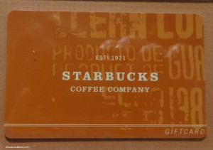
I bet in 2001, when the Starbucks card was just in its baby beginnings, nobody thought about people activating 2.4 million cards in one single day. In February 2001, the very first card was given to partners – shown to them as a prototype, original concept, and distributed to partners attending a leadership conference. That 2001 card looked like this:
 In November 2001, the Starbucks card was officially launched to the general public. Between November 2001, and July 2002, Starbucks customers activated four million Starbucks cards. The first card available to the general public was the “Snowflake” card that featured white snowflakes on a silver background. This card came with a red holiday sleeve although when first loaded, if the customer put $100 or more on the card, they were given a special tin case.
Flashback for a moment to the original concept, prototype Starbucks cards: Deep inside the headquarters, six prototype cards (probably seen by very few outside of the headquarters) are framed on a wall. Here are the 2001 original concept Starbucks cards:
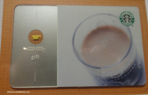
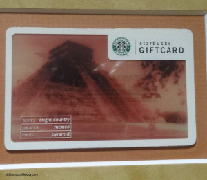
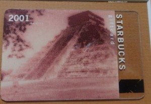

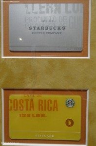
 Now you’ve seen the original 2001 concept Starbucks cards! If somehow you have one of those six cards, hold on to it. It is precious.
(For Starbucks history, I used the BucksCards.com website as a reference – if you want to browse cards, it’s the most complete catalog of cards that I know of.)
Flash forward twelve years, one of the more collectible current Starbucks cards is this rose metal card:
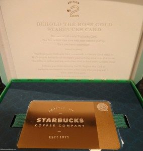 If you want one, your best bet is eBay. I sort of think it’s amazing to see the then and now of the Starbucks card. If you like browsing through articles about Starbucks cards, I recommend reading the articles in the Starbucks card category of this site.
What do you think of the original concept cards? Should Starbucks resurrect one of those original six designs?
Related posts
11 Comments
Leave a Reply Cancel reply
You must be logged in to post a comment.
Sponsors
Recent Comments
- DEVIN on Compostable Straws Land in Seattle Starbucks Stores
- coffeebeanz on Why do you go to Starbucks less often? (If that’s true for you)
- Willi on You can now buy a Siren statue: $6,000
- Willi on A major revamp of your drink recipe: Testing syrup extracts and cane sugar
- Skip on Why do you go to Starbucks less often? (If that’s true for you)


Starbucks was one of the first companies to use a card like this. I think when we look back years from now on how gift cards have transformed consumer spending, Starbucks will stand out as one of the innovators in this arena.
Very informative & interesting … As usual! Adding to what Chris said, I’m sure that Starbucks is also an innovator in the introduction of the Braille gift card this year.
🙂 Aymee
@SatOnMeeting
I really like the original cards, mainly because of what I kind of interpret their non-primary purposes to be, as they seem to me to have a bit more of an artistic flair- certainly much more so than the completely utilitarian gold cards they use as their main “member” (gold) cards today. (If course, there are tons of different designs now used on what are more “gift” cards, but it seems, at least as I interpret them, that those “original six” membership cards had a touch more flair/artistic expression than at least most of what are used now. Even compared to the currently available gift cards, however- which come in an enormous variety of different designs- at least as far as true art is concerned, I quite prefer the older originals. Maybe it’s just the artist-slash-art historian in me coming out here, but it just seems to me that in the older ones, there didn’t seem to be quite as central, or at least quite as obvious, of a purpose/target/goal in the perceived message of its image(s). To me, the original Starbucks cards seemed to contain much more art simply for art’s sake than those used in the progressively more recent gift cards, all the way up to the most recent, essentially imagery-bereft gold cards, which are unquestionably now completely purposefully targeted to achieve a specific end goal or message.
(So yes, I greatly prefer the older, original Starbucks concept cards, and would love to see really any of them brought back or re-introduced!)
I would like to suggest that Starbucks use the cards to support social issues like they have in the past with their RED CARD (Bono’s organization) to address AIDS in Africa. How about a Charity Water card to support wells in Africa? Another RED CARD to address AIDS? Change the lives of your coffee growers with cards that would give a portion to building schools in each of the growers towns. 2.4 million in one day – if Starbucks even gave away 1-2% of the earnings on these cards – this company could put a serious dent in some major world problems.
Those are so cool! It’s funny how they really do seem ‘vintage’ even though 2001 seems like not that long ago. I love seeing this!
And I believe today was a big today for Starbucks card sales…I just got one today myself. (And a gingerbread latte…mmm)
Very nice. Perhaps they should bring them back! I think the SB card is great and of course I use mine often. I just wish they would rethink the rewards program. I know that has been a topic on another post!
Lots of great comments! I kind of like the designs of the cards that don’t have the clear strip. I really love the simple elegance of the single shot of espresso, and I like the bright yellow of Costa Rica.
@Hayley – 2001 was a long time ago!
@Penney – Another donation card is a great idea. There has been a Conversation International Card and (Red) card in the past.
Other non-profits that Starbucks has a history with is CARE – Throughtout the 1990s, Starbucks was often the single largest donor to CARE – http://www.care.org/about/partnerships – I would LOVE to see them re-connect with CARE. Starbucks seems to have just sort of forgotten about them.
Also historically, both Tazo Tea and Teavana have partnered with Mercy Corps- http://www.mercycorps.org/ – That would be another awesome partnership.
I’d totally support Starbucks re-engaging with CARE or Mercy Corps!!
Very interesting. I had never given much thought to the Starbucks card origin. I’d love to see some throwback type cards with maybe the old coffee stamps on them. Or even the new artwork on the coffee bags might make for an interesting card design.
I really like those original designs, they look unique. My current favorite is the braille card, its so different.
My team (I and another designer) came up with and designed those concepts. I also named the card.
I only use my Gold Card for back-up as I prefer to choose one of the beautiful design cards to match the season. I also wonder if the Gold Card is somewhat pretentious. In addition I do have a few cards from different locales such as Whistler, BC, and Texas. Does anyone know if Starbucks was one of the very first smoke-free environments?