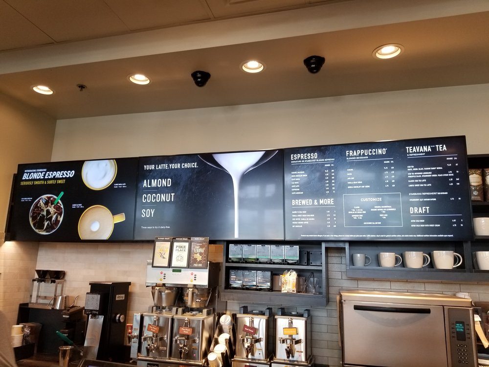
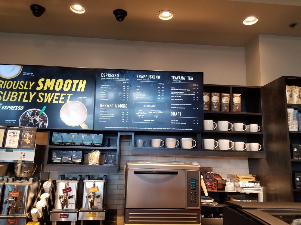
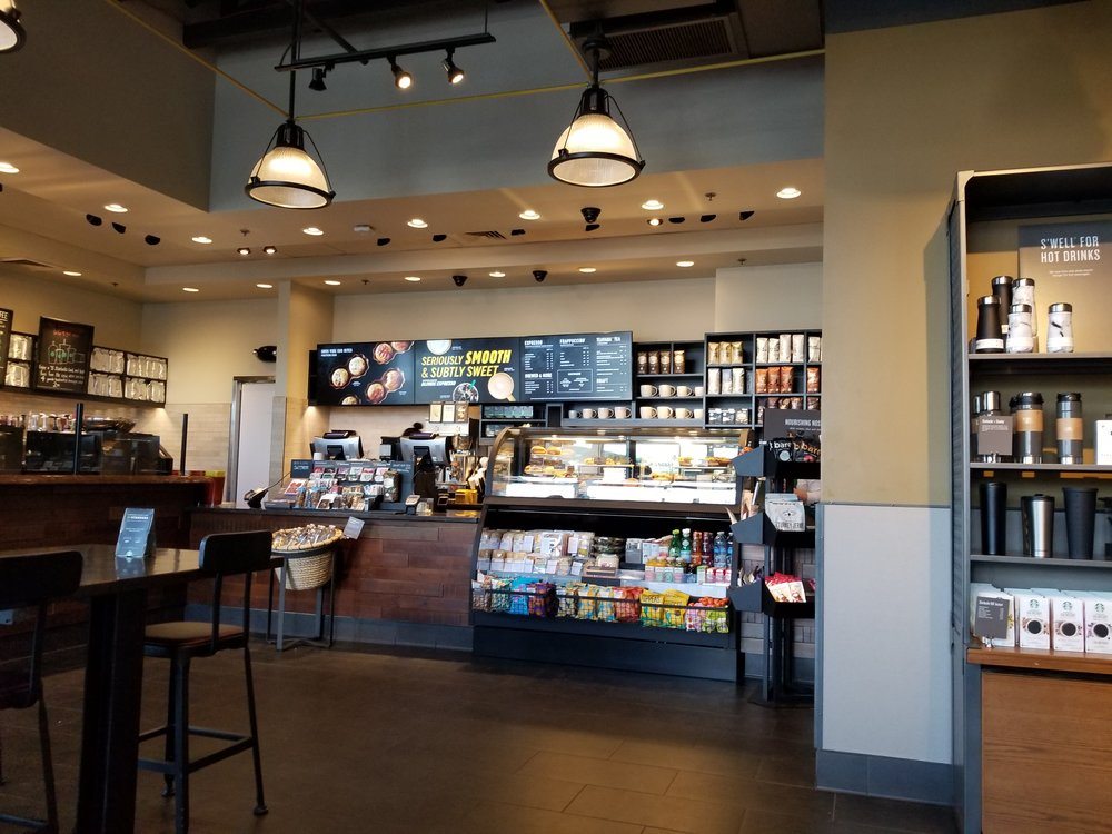
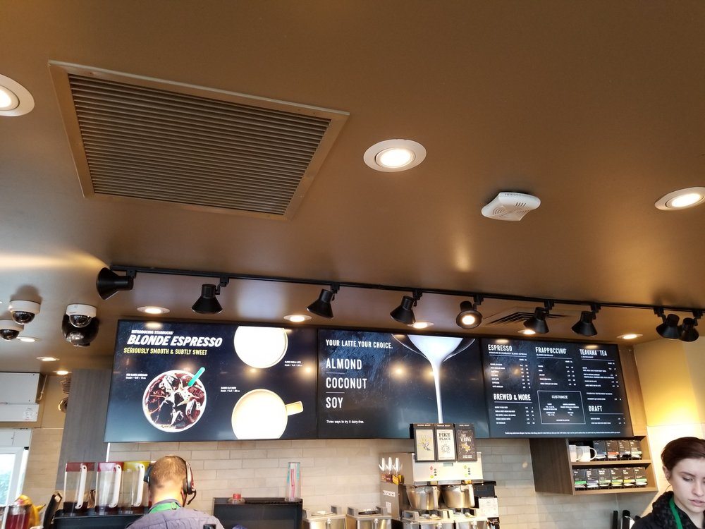
A couple of Starbucks located in Tacoma, Washington now have huge digital menu boards! Today I visited two Starbucks stores both using them. One was in Tacoma and the other in University Place (which is a small city immediately adjacent to Tacoma).
The menu boards have high quality displays with bright colors, easily popping out at you from a distance away. The displays can fade in and out – For example it might display an image promoting Blonde Espresso or alternatively it may display alternative milk options. I also saw a display featuring the Starbucks Sous Vide Egg Bites. The actual menu portion of the board uses white font against a black background.
This is not the first time that Starbucks has experimented with digital menu boards – there was a single store test in 2010!
On the plus side, no more wasted paper, constantly changing and then tossed out in a few months as promotions change. There are something like 13,000 United States Starbucks locations – that’s a lot of printed paper menus, ever changing and tossed out. On the down side, most stores are designed to have extra storage shelving immediately behind the menu boards and now with the digital menu boards, that space is lost. One concern could be that if the store has no control over what’s being promoted on the menu boards, it is possible that the menu boards could be displaying products that the store has sold out of, or for one reason or another the store doesn’t carry that product.
What do you think?
Take a look!
Related posts
12 Comments
Leave a Reply Cancel reply
You must be logged in to post a comment.
Sponsors
Recent Comments
- DEVIN on Compostable Straws Land in Seattle Starbucks Stores
- coffeebeanz on Why do you go to Starbucks less often? (If that’s true for you)
- Willi on You can now buy a Siren statue: $6,000
- Willi on A major revamp of your drink recipe: Testing syrup extracts and cane sugar
- Skip on Why do you go to Starbucks less often? (If that’s true for you)


Who is providing the DMB’s and what CMS is Starbucks using? Is this information made public?
The board has a shiny surface which creates a glare no matter what view you have. Board needs to have a “flat” background surface. The board is huge, so why is the entire menu squeezed onto 1/3 of the board, in tiny print? Poor design. Great idea to go digital, but this one was not thought through very carefully.
When Starbucks is packed, and the Baristas can reach behind the board and make great time without running into each other, or running to fetch far-away product – that’s excellent efficiency! Remove that aspect for a tiny and shiny board with tiny print, and headaches may be in the offing. I like the cool, relaxed and friendly efficiency – don’t fix what isn’t broken. Your Baristas deserve to shine, and we customers deserve and come back for ambience that matters.
NO!!!! Please no! We have enough shiny screens distracting us at all hours of the day, we certainly don’t need one at Starbucks. Oooh look, steamed latte milk is pouring! McNuggets are being dipped in sauce! Ask for the purple pill! No, no, no, no, no….
I actually like this. I like that it saves paper. As long as it’s easily readable, I’m all for it. Of course, I never use the menu as I always know what I want. :p
Going to miss the chalk art by the Partners though…
I agree that the print size is small. They need to look at Airline boards for font size!
Love them. I’ve seen them in person, including the new Sea-Tac Airport C Terminal Starbucks location. They are awesome in person…less so in photographs. They might even have less glare than the current plastic that covers the paper menu inserts.
I’m sitting in a Starbucks with 6 paper menu boards and one chalkboard (all 7 lined up in a row).
Only two of the boards have a “menu” on them. The remaining (including the chalkboard) all have big images and poster type images.
So perhaps we’re already in the era of diminished menu boards, making screens not only inevitable, but also more practical.
As a former partner, I remember how many menu signs, and signs in general, we recycled every week, along with the boxes that the menus were shipped in. I can imagine this will decrease a significant amount of paper waste. I agree there are drawbacks–glare, loss of barista art–but perhaps stores will be able to control the menus so if they run out of a menu item, they can somehow remove it from the board. So few of Starbucks’ drinks tend to actually be on the menu, it would be nice if these boards could clarify what customers can actually get. I was always puzzled by the number of items we could make but that weren’t obvious to people if they weren’t regular customers (matcha, syrup flavors, smoothies, what have you.)
Great… The cost of these digital boards will certainly be added penny by penny in the costs of our drinks…
Do I think digital menu boards make sense? Yes.
Do I think that replacing the paper or hand written boards makes the store a little less personal ? Yes.
Digital boards would likely be easier to update, and eliminate waste. But what I hope would not happen is the boards continually change screens every few seconds. At McDonald’s or the digital signs on roadways for example, you often don’t have time to read the screens fully before it changes and you have to restart reading it. It would be frustrating to have to review rapidly changing screens. Maybe, at this point in time, people already know to ask a cashier (I’m looking at the lowest common denominator) about what’s available or how to order what they don’t see on the menu. Or the menu could even suggest “Ask the cashier about new beverages”.