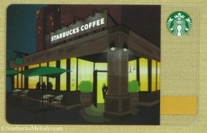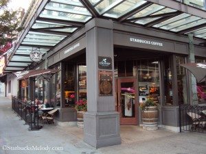
 This “City Nights” First and Pike Starbucks card is widely available in Starbucks stores. I thought that many people would be curious to know that it’s based upon a real store. The store on this card is an artistic rendition of the First and Pike Starbucks, which is the “Heritage Starbucks.”
This Starbucks is directly across the street from the entrance to Seattle’s Pike Place Market, and if you look at the doors at the right angle, you often can see a beautiful reflection of the “Public Market” sign.
Now if someone asks, “Hey what’s that store featured on that card?” you will have the answer! First and Pike Starbucks.
At about 7:30 a.m., on August 26th, I dropped by in hopes of getting a decent photo of the entrance. It’s a busy store, and so at any other time of the day there will be a constant stream of people coming and going, to and from this store.
I ordered an iced Kenya from the Clover, and a coffee master name Lindsey made my beverage. I asked her if she knew that this “City Nights” card is really based upon First and Pike Starbucks? She said, “yes” that she did know that, and added, “Hey can’t you see me in the picture? I am right there,” as she pointed to the little people inside the store on this City Nights card.
Obviously she was having fun with me, but I got a good laugh out of it. Thank you Lindsey!
I find it fascinating when Starbucks bases cards on real stores. I wouldn’t mind seeing a few more cards stylized after real stores. It wasn’t all that long ago that the “Twilight” Starbucks card based upon the First and Battery Starbucks was popular in stores.
What stores do you think would work on a Starbucks card?
Related posts
9 Comments
Leave a Reply Cancel reply
You must be logged in to post a comment.
Sponsors
Recent Comments
- DEVIN on Compostable Straws Land in Seattle Starbucks Stores
- coffeebeanz on Why do you go to Starbucks less often? (If that’s true for you)
- Willi on You can now buy a Siren statue: $6,000
- Willi on A major revamp of your drink recipe: Testing syrup extracts and cane sugar
- Skip on Why do you go to Starbucks less often? (If that’s true for you)


Funny story from Lindsey. I would never have said this card was the Heritage storefront until you pointed it out. I guess it’s the lack of the glass awnings that threw me off.
Melody I actually think it would be nice for SB to do a series of cards of their various stores. How neat would that be to show off the stores and have each region share some pride in their stores. Remember the store you highlighted in Texas right made out of the container with the garden on the roof? That would be a neat card! Also, the Soho store in NYC. Gosh, there are so many choices.
@Purple1 – I totally agree. I’d like to see a whole series of these. The really generic green card with mugs on it is a little boring to me! And that card gets an update version for next Tuesday and it’s still more generic green and mugs!
@Melody – your question at the end of your post prompted me to go look at Winter’s website to see all of the pictures of the various Starbucks locations around the globe. @Purple1’s suggestion of a card series is a great idea.
Also your reply to Purple about “a little boring” is exactly why I liked the Vancouver card so much. It clearly had more thought put into it. After all, isn’t there a Howard/Starbucks saying about the passion that goes into the cup being transferred to the person who receives the cup? It would be nice to see a bit more passion put into the cards.
Based on your info re this card, I see them displayed at the register but without any info attached to it I would never have known its history. That is a shame. I also would love to know if there is a committee or design team at SB that works to create new cards. Perhaps as a thought each region can bring together a team to create region themed cards? Also, it would be nice if customers could have some input into the card designs?
@Purple1 Starbucks appears to do nothing to tell partners that the card is based upon a real store. Outside of downtown Seattle, I never meet any partners who know this card is based upon the First and Pike Starbucks. And even downtown, a lot of partners don’t know this piece of trivia.
This newest card does look very much like the 2010 green swirly coffee one…… as I wrote on FB, I’m just glad at least there’s COFFEE involved.
Aside from some classic card, I’d really like to see the city/state cards more often. I think they should be as standard as a “happy birthday” card.
@CD – I thought the Chicago card, and the 2011 Seattle card were incredibly well thought out. The Seattle card meshed together so many Seattle iconic things – coffee, the space needle, music, rain – THAT is the kind of passion for design that should go into EVERY single Starbucks Card.
And you’re right – Winter’s website is great to browse for ideas of great Starbucks store fronts!
Does anybody know if this card was printed on two layers to give a “3-d” effect to the painting? My friend and I are arguing about this. Thanks!