I love seeing Starbucks signs that are hand-drawn by baristas! I thought it would be fun to share a whole series of chalk art photos I’ve been taking. This is just a tour of some fun Starbucks barista-created chalkboard art – I have organized the pictures below by their stores.
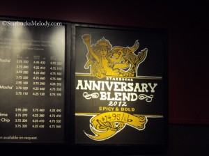
SEATTLE MUNICIPAL TOWER (aka Key Tower)
^ That is entirely hand drawn. When I first saw it, for a moment, I thought that might be a cut out. But that has the signature of shift supervisor Scott’s work. Readers of this blog might recall that last year I raved and oohed and awed over Scott’s rendition of Starbucks Christmas Blend 2011. His tiny little office tower Starbucks – with just one single chalkboard – is super lucky to have him. I stop by now and then just to check and see what’s new from Scott!
OLIVE WAY
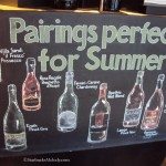
All of the Olive Way artwork was drawn by a barista named “Jim,” I think. I believe he actually works at the Terry and Republican Starbucks and does artwork for both Starbucks locations – Olive Way and Terry and Republican.
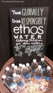
MAGNOLIA HOTEL – Licensed Starbucks in Denver
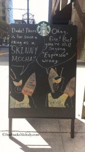
I snapped this photo on the 29th of September. It was a chalkboard sign on the sidewalk immediately in front of the licensed Starbucks store in the Magnolia Hotel in Denver. I thought a few of my readers might find this funny.
TERRY AND REPUBLICAN STARBUCKS
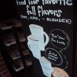
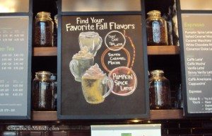
This beautiful sign for your favorite fall beverages is currently hanging inside the Terry and Republican Starbucks. And, again I think “Jim” is the artist. This is so beautifully drawn!
Hope you enjoyed this quick tour of some beautiful chalk art! I am often impressed at the talented baristas in green aprons!
Can you pick a favorite from above?
*******
I love it when I hear from readers and get blog ideas and/or images for blog posts. My email address is Melody at StarbucksMelody dot com. I’ve been hoping that someone would write to me with great images (that they took) that I could use in my blog. For example, I know that Starbucks is testing a Cranberry Mocha, and I would love images of the signage, the drink, and if you have tried it, tell me if you like it! Another example is the new container drive-thru store in Denver – I’ve been thinking it would be great to feature a few photos of it here, and I’ve crossed my fingers that someone in Denver would send photos of it. The new Denver drive-thru is an expansion on the design of stores built from shipping containers. The first one was this shipping container Starbucks in Seattle. So, I am looking for reader help for articles: I love getting photos of chalkboard art, international stores, and I’m looking for Cranberry Mocha photos and reviews. And I’m looking for photos of the Denver drive-thru … or anything else that you want to send my way that is current and interesting. Thanks in advance for your help!
Related posts
13 Comments
Leave a Reply Cancel reply
You must be logged in to post a comment.
Sponsors
Recent Comments
- DEVIN on Compostable Straws Land in Seattle Starbucks Stores
- coffeebeanz on Why do you go to Starbucks less often? (If that’s true for you)
- Willi on You can now buy a Siren statue: $6,000
- Willi on A major revamp of your drink recipe: Testing syrup extracts and cane sugar
- Skip on Why do you go to Starbucks less often? (If that’s true for you)




I like the Anniversary Blend chalkboard art the best but they all have their own style and it is so nice to see instead of those cutouts so prevalent around here. I really wish partners would take more time to showcase their talent and do chalkboard art.
I’ve always loved seeing chalkboard art made by baristas, I think that it’s a good way to win new customers. I would help you collecting some pics of those drawings, there are a lot around where I live but none of them is Starbucks 🙁
Anyway, my favourite is the first one, the picture you took at the Seattle Municipal Tower: that’s really impressive! The person who drew that is a real artist!
My photos of the new container store in Denver (it’s actually the first store in the city of Northglenn) don’t come close to the quality of the photos that were in the Fast Company article (first week of Oct). If someone doesn’t beat me to it, I will try to send you some good pictures. But check out Fast Company to catch a glimpse. The wood siding is actually reclaimed snow fencing from WY!
I had hoped that more people would like the hand drawn signs! I suppose everyone is lurking. 🙂 @Purple1 and Maka – It’s hard not to love the Seattle Municipal Tower Anniversary Blend art work. That artist, Scott, is someone I see now and then too because I go to that store, and I can honestly say is a super nice guy. So, that might be my favorite too. I love the 2011 Christmas Blend one that I linked to too.
Andrea, if you can send me anything, I’d love it. Thanks!
I would have to agree that Scott (SMT) is one of the BEST chalkboard artists out there– we all (from the Columbia Tower stores) take a trip over with each promotion to see what he has come up with this time! Thanks for taking the time to tour the stores & see what fun and interpretation we all have.
Erin thank you for commenting. You and I can be in the Scott-artist fan club together. 😉
I love great chalk art. I wish I had a talented partner to do my signs. I am even searching for one in the Los Angeles area who I can pay to do some awesome signs! *hinthint*
I love the chalk art and especially Scott’s work. I remember the blog post with his Christmas Blend bag and still want that made into a print for my kitchen!! One of the baristas at my local store is working on his artwork and trying to make some original signs so I’m hoping for some great stuff soon. I’d love to see more original chalk art for the holidays in a blog post here. Is that possible, Melody? Please please…
I wish I had more space for this kind of thing in my store. Now that I finally have someone who can draw, it’s a shame that I don’t have more space to showcase her talents!
That last one is awesome.
I work at Blockbuster and a colleague of mine hand draws billboards to promote certain films/offers. When The Avengers came out, he drew his own ensemble picture of them all.
Personal touches like that really add to a shop experience, especially when it’s a big brand. Customers like to see that there’s a fun side to a brand, not everything has to be serious and corporate.
I do like that first one. I really like seeing artwork in stores – gives it a more friendly feeling.
The one from Magnolia Hotel made me grin. Love how creative everyone is when it comes to chalkboard art! 😀
I love the art and signage! I couldn’t do anything close to this so to me this is pretty impressive.