DENVER:
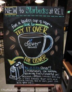
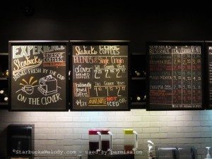
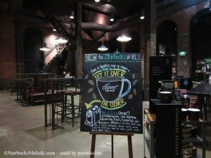
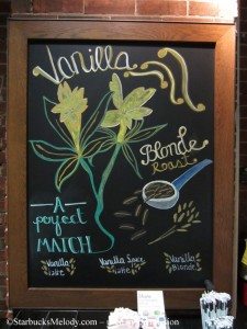
A reader in Denver sent me a few recent photos of the chalk art at his Starbucks. I love it. And partly, I have to admit I especially enjoyed the series of photos as I have actually visited this particular Clover Starbucks in Denver. I really had a wonderful time visiting Starbucks stores in Denver, and meeting partners in that market. So, it does tickle me pink to show off a little of their chalkboard art:
That Starbucks is actually attached to an REI store, and is in a huge, rustic space.
Hope you enjoyed the art! (I especially like the “Vanilla” chalkboard.)
SEATTLE:
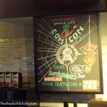
March 1st through the 3rd was the “Emerald City Comicon” which is held in downtown Seattle. During that weekend, I saw some absurdly packed Starbucks. Long lines. And two stores near me had special chalkboards to welcome the many visitors in town for Comicon.
On March 2, 2013, I dropped by the Pacific Place Starbucks and noticed this great chalkboard! I snapped this photo with my phone:
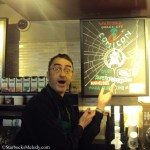
I went back to that same Starbucks the next day, in hopes of getting a better quality photo. I brought with me my camera the second time around, though surprisingly, my camera photos don’t look any better than my phone pictures. The second time I was there, a barista named Dan was working. He recognized me and saw me taking pics of the chalkboard art. At one point he said to me, “Hey Melody, you didn’t get me in the picture!”
In my totally serious tone of voice I said, “Dan, I was trying to NOT get you in the picture!” He laughed and said he wanted to be in it. I warned him, “You’ll be all over the blog Dan!” He volunteered to give me a funny pose. And so here is barista Dan showing off that same chalkboard. Dan has been a partner for a very long time. I see him working mornings a lot. One thing about him, he always looks like he is having fun at Starbucks.
I also dropped by the Starbucks at 7th and Pike on that day. (The two stores are only a few blocks apart.) I really wanted to take photos of the customers. So many were in all kinds of Comicon-inspired costumes! A couple of the baristas had red capes to go with the weekend’s theme. It was crazy busy. That afternoon at the 7th and Pike Starbucks was busier than many of their morning rushes. I did manage to get a photo of their chalkboard too:
That’s it for this episode of chalkboard art. This is an open thread. Talk about anything Starbucks-related. (Thank you Dan for the fun pic!)
Related posts
12 Comments
Leave a Reply Cancel reply
You must be logged in to post a comment.
Sponsors
Recent Comments
- DEVIN on Compostable Straws Land in Seattle Starbucks Stores
- coffeebeanz on Why do you go to Starbucks less often? (If that’s true for you)
- Willi on You can now buy a Siren statue: $6,000
- Willi on A major revamp of your drink recipe: Testing syrup extracts and cane sugar
- Skip on Why do you go to Starbucks less often? (If that’s true for you)




Absolutely love the chalkboard art! The signs continue to be so boring at my local store that it is starting to frustrate me because I can really see having vibrant and exciting signage makes such a difference. I do see people in line ordering the hazelnut drinks so it seems like they are popular. Thanks for the pics Melody.
@Purple1 – Someday, you should send pics of your local store. No matter what it looks like (including signs) the important thing is the partners in it. 🙂
I do think chalk art adds a lot to a store – I love scrolling through the whole category –
http://www.starbucksmelody.com/category/chalkboard-art-and-starbucks-partner-creativity/
Melody I totally agree the partners make the experience good or bad and my local store has both good and bad. I know all of them and they know me so I do not even have to walk in and order – they see me and know what I want! That is very nice. My local store was supposed to start their remodel in Feb. Well, so far nothing and the SM just is not sure when it will begin.
Love the chalk art as usual. How terrific that they went all out for the comic con! I have one store that I like to go to because they make an effort to have some chalk art. Not fabulous but at least trying. This store’s barista even asked for my and my daughter’s names for our cups last weekend. She drew a cute heart on my cup. On my daughter’s she wrote her name and “aka cute scarf” since she liked the scarf she was wearing. Nice touch we thought.
thumbs up to chalkboard art. 🙂
The chalkboard art is lovely! I love how vibrant it is. Having said that, we’re required in my area to have our boards set to standard. @purple – it’s possible that your store has been given a similar set of rules?
Michelle you are correct re the rules for the boards have to be a certain standard, however, that being said I also know it is not followed to the ninth degree and I also have been told you can do chalkboard art. The back and forth drives me crazy because at my local store I know of one partner in particular that would jump at the chance to do chalkboard art.
@purple – Every store/district/area is going to prioritize things a little differently. Both things you have heard are true, and what it comes down to is how the leadership in your store/district/area interprets it, and how flexible they are. My store is in a mall, and sometimes, when the mall does promotions, we do a deal to go along with it, and change up our chalkboard sign to reflect that deal. I do so because my DM, and his RD are OK with it – they know what the standard chalkboard is supposed to look like, and they are OK with it changing up if it drives sales. Sounds like the Comic-con store is in an area that feels similarly.
It sounds like the leadership where you are have determined, rightly or wrongly, that intricate and involved chalkboard signs do not have the return on investment they would like. I love a good chalkboard sign, but when it comes right down to it, any time a partner spends working on a sign is time my team is not spending training/sampling/analyzing business results, and at this point, I prioritize those things.
Great chalk art all around! I like that they did Comicon-related chalkboards – I imagine that went over well with the attendees.
Melody like your new masthead. I always think it is nice to change things around.
@Purple1 – Thank you for noticing! I was wondering how the new header would go over. I really wanted to be able to capture the idea that this blog will write about Teavana, Tazo, and more, and not have those articles be a surprise – I think there might be readers who don’t realize how many Starbucks subsidiaries there are. (I’ve met partners who don’t realize how many brands that Starbucks owns.)
Most of the stores here in the Norfolk, Virginia area have just the standard chalkboard art, but a few have some lovely designs. I find myself frequenting those locations more often just because I want to see what they come up with. Sometimes, when I’m at a Starbucks with the generic standard art, I wish I could just volunteer to draw on the boards myself! It seems like it’d be fun.
On an unrelated note, Melody, have you considered having a link to the comments section at the bottom of each post on the main page, in addition to at the top? You may be missing out on commenters who expect to find the comments link at the bottom. I know I always have to do a little double-take when I read to the end of an article, then have to scroll back to the top to click and read the comments!