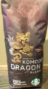
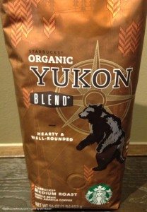
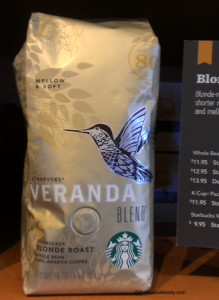
Starbucks core whole bean coffees are going through a major overhaul in their packaging design. I’ve been delighted to see the new designs, as they look like they have a lot more personality than the previous design incarnation. I know that at this point, many people have seen many of the new designs, but just in case you’ve missed these, take a look at the beautiful new coffee packaging:


 The Yukon Blend is stunning. That bear looks fantastic. Which one is your favorite so far?
Related posts
18 Comments
Leave a Reply Cancel reply
You must be logged in to post a comment.
Sponsors
Recent Comments
- DEVIN on Compostable Straws Land in Seattle Starbucks Stores
- coffeebeanz on Why do you go to Starbucks less often? (If that’s true for you)
- Willi on You can now buy a Siren statue: $6,000
- Willi on A major revamp of your drink recipe: Testing syrup extracts and cane sugar
- Skip on Why do you go to Starbucks less often? (If that’s true for you)


I like the Veranda packaging. Off topic I know but will find it interesting that SB will begin posting calorie of drinks, etc. Wonder if that will change customer’s minds about choice of drink or size of drink?
@Purple1 – I saw that in the news –
http://www.fool.com/investing/general/2013/06/18/news-starbucks-to-post-calorie-count.aspx
Interesting! We’ve had calorie information for years on all King County menuboards. I don’t think it makes much of any difference. Mostly, I think what people say they want and what they really want are often two different things: People articulate how much they want low calorie, low fat, and healthy foods, but when push comes to shove, they really just order what’s delicious to them. Obviously not everyone, but there seems to be a trend to just order what you like and ignore the calorie information. At least, that would be my anecdotal observation.
I am partial to the Komodo Dragon Blend bag but then that is one of my favorite Starbucks coffees ever. 😉
I love Light Note blend 🙂
@Sandra Trolinger 🙂
@Kei – I approved your comment, though I’m not sure what you were trying to say. Lite Note Blend was discontinued about a decade ago in the US – do you still have it where you are?. I am glad you liked it.
I am very pleased that my favorite coffee, Komodo Dragon, has a package worthy to hold the beans.
The new bag designs are exceptional.
I love the new packaging! It makes core coffee look like seasonal coffee year round…they must have realized, like the rest of us, that the color coded packaging was boring and detracted from talking about coffee…which is what it’s all about! I can’t wait to get some Veranda just for that hummingbird-it’s working already! Right on Starbucks~
Love the new bags! I agree, they look much better than the design out right now.
Also, Lightnote is still available as a blonde roast in Japan. 🙂
@Rach – Thank you for the information. I really did not know that Lightnote is still around as a Starbucks Japan coffee offering! Glad you like the new designs too. Take care and thank you for the comment.
the yukon is my favorite so far! i can’t wait to see these bags in stores, they are so stylish!
I must have missed it a long while back, but why is there not a picture of a Komodo Dragon on the packaging? Don’t get me wrong! I prefer the look of a Dragon over a Komodo Dragon, but…..
so much better than the plain all the same packaging they have been using
Melody, I think you are partially right about the nutrition information. Not everyone is looking for low cal or low fat, but some people like myself do want to have the information. If I want a drink at Starbuck I’m going to have it regardless of of fat & calories, but I might reduce or restrict elsewhere in my diet to make up for it. Also I might skip the extra goodies if the counts are too high. My mom will not order certain items in restaurants if the fat, salt or calories are too high. I think full disclosure is great. It keeps companies in check & allows us to be better informed consumers.
FINALLY, we have gotten it right!! I have always said our promotional coffees sell so well because of the attractive packaging, in addition to how wonderful the coffees inside are. Sadly many people make their purchasing decisions based primarily on looks, and the old color-coded bags were lack-luster and above all CONFUSING…it was my experience that MOST customers had to ask for us to find their coffees for them since they simply could not distinguish one bag from another. Not to mention the decaf dilemma–I always checked when people were buying decaf (sumatra, espresso, pike place) and 80% of the time they had no idea they had grabbed a bag of decaf!!
I’m so happy Komodo dragon is not getting the “morning joe msnbc” ridicoualous graphics!
Hi Matt! I wasn’t a fan of the “Morning Joe” graphics on the bags of coffee either – but I think those were only on the Gold Coast Blend coffee, not Komodo Dragon. We’ll have to see what Gold Coast will look like – it’s one of the few that I haven’t seen yet. Years ago, Gold Coast had the Chicago skyline on it, and a woman walking her dog – great packaging design!
Hi Guys, Check out the interview with SB about the new designs on The Dieline http://thediel.in/17CtFWA
I didn’t know about the new packaging a couple weeks ago (guess I should have read this blog post sooner) and had a hard time trying to find a package of whole bean Veranda Blend (which used to be called Blonde Veranda Blend)
I have updated my Evernote with current pictures of the new bag.