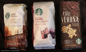
 Starbucks Caffé Verona gets a whole new look this month: the new Starbucks packaging should begin appearing in stores this month. (A sneak peek at House Blend is here.)
A reader of this site sent a photo he took from his Verona collection – he’d saved a couple of old bags of it! Verona is Starbucks’ oldest proprietary blend. Three years ago, I wrote an article about the history of Verona, and I still recommend reading through it for an interesting history lesson about this wonderful coffee:
In my Starbucks memories, Verona has been represented by a cherub, a bridge with a romantic couple on it, and now roses. I like the new packaging! What do you think?
And, a huge thank you to the reader who sent me this fantastic photo. It’s great to see the three bags lined up next to each other.
Updated in 2017:
This article is now very dated! If you want the real story of Caffe Verona (which involves some whiskey!) read this more recent StarbucksMelody article.
Related posts
14 Comments
Leave a Reply Cancel reply
You must be logged in to post a comment.
Sponsors
Recent Comments
- DEVIN on Compostable Straws Land in Seattle Starbucks Stores
- coffeebeanz on Why do you go to Starbucks less often? (If that’s true for you)
- Willi on You can now buy a Siren statue: $6,000
- Willi on A major revamp of your drink recipe: Testing syrup extracts and cane sugar
- Skip on Why do you go to Starbucks less often? (If that’s true for you)


Love it!!! I can’t wait to get the new packaging in my store.
I like the new packages, they are great. I hope to see it in Bulgaria :))
Verona is one of my favorite, oldest every-day coffees. I do like the new packaging, too….much better than the current ones. (blah)
Very interesting to see the transition from one design to the other. They basically still stayed in the same color tones.
this is one of those coffees i sort of remember my training on (i was a barista for starbucks in the late 90s/early 00s), even after all this time. our training books and store resources had little histories on every blend, and this is one of my favourites. i mean, you know you have a good coffee when you have to re-create a blend that’s only available in one restaurant on the planet!
as for the packaging, i really love the earlier bag, and even the second one was one of the better ones in the last line of packaging.
the brand new bag is okay, and i understand the roses are supposed to keep with the romantic feel of the coffee and chocolate pairing, but that couple on the bridge just always made me happy 🙂
i also used to do the chalk art for my store (oh so long ago), and verona and gold coast were a couple of my favourites to draw!
@Elly – So true the couple on the bridge were a great site. Supposedly, that bridge is in Verona, but Seattle has one that looks almost identical, located near Lake Washington. Roses might be easier to draw?!
do you mean the montlake bridge (over the water, not the i5 one)? there’s another bridge out that way that i can’t remember the name of, close to eastlake.
we might need to book a trip for verona to do some research!
Fun to see the packaging lined up. I designed the original bridge/couple package (as a sr. graphic designer for Starbucks). The couple is my sister and her husband! It was a beloved image for many years and I’m honored that it lived on for so long. Thanks for featuring Caffè Verona!
Hi Sandy! Thank you for coming by! I am flattered to have the designer of that packaging leaving a comment! I had always heard the story the Verona Bridge on the Caffe Verona packaging was that very old bridge in Seattle’s Arboretum with two partners as models, and then some artistic rendering. Was the bridge in the Arboretum the one used for the Verona packaging?
Hope you’ll come back again soon. I think this is an amazing fan community on this little site. 🙂
So if i see the middle bag, white w/ couple on bridge, for sale on eBay…I can assume they are expired bags of coffee?
Verona is one of my favorites. I do miss the old bag look.
Do You know what is the meaning of those tiny red triangles over the “caffe verona” caption?
Do you know what is the meaning of the flower at the Caffe Verona packaging? Thanks
Vern:
The red roses on the Verona packaging symbolize love and romance which was the intent of the original Caffè Verona stamp design. The original rose was done as a linoleum block print pattern…the latest version of the flower (still a rose) is a more simplified / modern take on the original pattern. [I’m the designer of the first package as well as the stamp dating back to 2001.] Thanks for asking! And thanks to StarbucksMelody for telling so many great Starbucks stories!