 On a number of occasions, I’ve mentioned that there is a physical Starbucks Coffee Gear store. It’s a place where you might find unique Starbucks logo-ed or word-marked items, not offered inside the actual Starbucks stores. The one Coffee Gear Store is on the 8th floor of the Starbucks headquarters building, at 2401 Utah Avenue South. It’s open to the public, and operates standard business hours, Monday through Friday. If you’re a partner (meaning a Starbucks employee), you can order online from the Starbucks Coffee Gear store website.
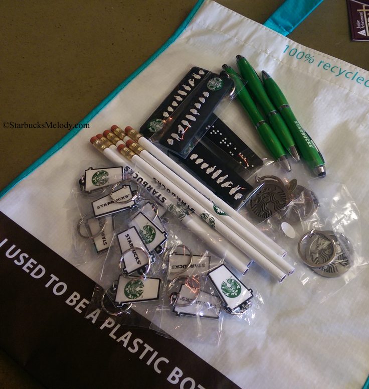
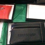
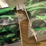
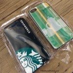
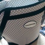
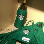
I dropped by the Coffee Gear store on Friday, August 29th. As you can see, there are pens, pencils, keychains, official Starbucks work shirts, iPhone cases, recycled Starbucks bags and much more. Have a look at some of the stuff you might find at this one-of-a-kind store:
In fact, I regularly get asked what to do that’s Starbucks-related when visiting Seattle. There really is a lot of see. I’ve done previous articles on this topic, but Starbucks is quick to open new stores and so my list of what to do has changed a little over time. Here are my top Starbucks-vacation ideas:
- Visit the Coffee Gear Store. That’s a must-do thing if you’re doing a Starbucks tour of Seattle. Go to 2401 Utah Avenue South in Seattle and head up to the 8th floor. From there, you’ll easily find it off the elevators, to your right.
- Visit the Starbucks Roastery – Okay, we’ll you can’t do this yet because it’s under construction right now. It’s on the corner of Pike and Minor, just past the downtown area, into Capitol Hill-First Hill neighborhood in Seattle. My guess is that it will open in late December.
- Visit 1912 Pike Place Starbucks – You can visit the store “where it all began.” You’ll find unique merchandise, hand-crafted espresso with a manual espresso machine, and a friendly experience.
- Visit Roy Street Coffee and Tea – This is one of the few “experimental” Starbucks stores. Its menu and store design hardly even resemble a Starbucks. There are no blenders. Beer and wine is available. And you’ll get a beautiful shot of espresso from a manual machine. You can pay with your Starbucks card and earn a star but there’s no way to use a reward at Roy Street.
- Visit an Evolution Fresh Juice Bar – Starbucks operates several Evolution Fresh juice bars. There’s one on Pine Street downtown as well as one in Seattle’s University Village shopping area. Don’t forget to pick up a collectible Evolution Fresh Starbucks card while you’re there.
- Visit a concept shipping container Starbucks – Seattle has two of them. One is the original shipping container store, called the “reclamation” concept store in Tukwila (on the edge of Seattle and Tukwila.) There’s also a shipping container Starbucks in the Ballard neighborhood of Seattle.
- Visit the Teavana concept store in University Village – This store is spacious and has an assortment of food and beverage. You can enjoy a carbonated tea, lunch, and smell lots of wonderful loose leaf teas.
- Visit the “skybucks” Starbucks – This Starbucks is located on the 40th floor of the Columbia Tower in downtown Seattle. The Starbucks itself is quite normal, however it’s on the only Starbucks in Seattle where you can enjoy your latte and spectacular views of the city from the 40th floor of Seattle’s tallest building. The views make it fantastic – and it’s open to the public!
- Visit East Olive Way Starbucks – This large store has a fireplace, one of a kind design, beer, wine, small plates, and offers regular coffee seminar events every other Monday evening (call ahead to confirm their schedule). You’ll find this store at the corner of East Olive Way and Summit, in Seattle’s Capitol Hill neighborhood. Here it is on the Starbucks store locator.
- Visit the University Village III Starbucks – This is a very beautiful store and is worth visiting just for that reason alone!
- Take a ferry from Seattle to visit the new Bainbridge Island Starbucks, on High School Road at the Island Village Shopping Center.
Related posts
21 Comments
Leave a Reply Cancel reply
You must be logged in to post a comment.
Sponsors
Recent Comments
- DEVIN on Compostable Straws Land in Seattle Starbucks Stores
- coffeebeanz on Why do you go to Starbucks less often? (If that’s true for you)
- Willi on You can now buy a Siren statue: $6,000
- Willi on A major revamp of your drink recipe: Testing syrup extracts and cane sugar
- Skip on Why do you go to Starbucks less often? (If that’s true for you)






Off topic but I like the new mobile or iPhone interface you are using. It doesn’t have your typical graphics but the navigation is greatly improved and so is the readability.
@CD – That’s important for me to hear. There’s a long story but essentially the blog has now been stripped down to the default wordpress template style – which actually is surprisingly mobile phone friendly!
Hopefully the long story isn’t because of more site problems and if so hope they’re just temporary. But it does work well on mobile.
As for the list of things to do, you should have listed the Verona bridge – especially since it’s been removed from the packaging. Your chapter with Minori in your book that discusses the search for the bridge was one of the great personal stories in the book.
Perfect timing, Melody! I’m visiting Seattle for a couple days next month! Thanks, as always.
OT, too but I like the new look. Much ‘clearer’ somehow! Of course, would LOVE to go the ‘Gear store’…….. ;(
@Denise – I appreciate the feedback. It might stay like this quite a while. I was running Thesis 1.8 and having compatibility issues with WordPress. At one point (quite a while ago) I’d looked at installing the Genesis blog framework, and had a stressful (and huge waste of money) episode with a blog designer – and a huge problem of stretched images. It was weird.
Finally, I hired a new designer and I just said “let’s just use the WP default” – which IS mobile phone responsive and will work with my many images and so on … It’s amazing what a great blog the very basic WP default template is. It would be nice to have a sophisticated blog theme and framework, but at least for now, it’s this default.
So hope that others like it too! Looks so much better on my phone!
Loving the new look Melody. It’s fantastic!
@Chris – Thank you! It’s really important for me to know that my regular readers are okay with this layout.
I just shared this post with some friends in town from New Zealand! Perfect timing!
And, yes, loving the new mobile formatting! I’m doing almost all my reading on the phone now and this makes it so much easier to read and keep up with!
Also, while not quite a destination for many, I do enjoy the little micro drive thru near me.
@Melody, another enjoyable post.
Now to go OT. I like the new “clean” simple look. However the change seems to no longer notify me of new blog posts or to comments that I subscribed to. I have re-checked “Notify me of new posts by email” and checked “Notify me of follow-up comments by email” so I’ll see if that corrects things.
All forward thinking companies are switching to mobile friendly pages. Too bad Starbucks hired a web company that is not forward thinking.
@DadCooks – I can look into that. I would suggest you check the box in the left rail where you enter your email address. When this blog was brand new, email subscription was done via Feedburner. That no longer is the case. A couple of years into it, it was switched to Jet Pack plug in. So there are like 900 >other< subscribers that theoretically are getting blog updates via Feedburner, outside of the 989 getting blog updates via Jet Pack plug in. But I wonder if somehow the Feedburner subscribers got disconnected with the blog change … will look into that.
Dad cooks I too did not get this in my email box as I usually do, but melody I also like the new look. Wish us plain folks could access the gear store without going to Seattle.
@Purple1 – That kind of tells me that somehow we’ve disconnected the people who were the early sign ups under the Feedburner system.
Please sign up again! Thanks!
Comment notifications should be working again. Sorry for the issues, everyone.
Hi Melody,
I’ve noticed a couple of stores in my area (Highlands Ranch, CO) have a-frame signs in the drive thru advertising mini frappuccinos and this started with the new fall promo. I haven’t had a chance to ask what they are yet as I’ve always been in a hurry, but I’m wondering if you have any insight as to what they are?
Thanks!
Kelsey
@Kelsey – Yes, the “mini” Frappuccino test is underway now. As far as I know, it’s a current test in the Denver and Houston markets, select stores. In short, it enables customers to buy a 10-ounce Frappuccino. This is something I’ve been watching closely, as it started out as a very small summer test in San Diego.
I’ve been planning an entire future blog article on this, which you’re getting a huge preview of in this comment. 😉 It’s not totally clear to me if Starbucks is trying to capture the market of customers who want to have a “kid’s size” Frappuccino OR if the intent is to be able to offer a Frappuccino at a lower price point, and thus be able to compete with value menus at some fast food places — Or some combination of both of those things.
Be on the look out for a “mini” Frappuccino blog post article coming soon!
@Melody – Very interesting! I might have to check it out this weekend to see what it’s all about. As a former barista, I know that customers would frequently ask about kid’s sized frappuccinos since Starbucks has kid’s sized hot drinks so my guess is they’re aiming for that market. I’ll let you know how it is and I look forward to reading your blog post about it!
@Kelsey – I’d appreciate any photos or anything you want to send me from your experience. It would be cute to see your adorable 10-ounce Frappuccino photos! Melody@StarbucksMelody.com
Ahhhh! I didn’t get to do all these when I visited. No Roy St., No 40th floor which I really wanted to do!! And no Melody meetup 🙁 I did get another pen and using it now, it’s like the green one but a really pretty burgundy color. I <3 it.
@Melody, the [New post], [New comment], and [Subscribe] functions are working like the good ol’ days.
Thanks @Zombarista for helping Melody with her site.
This new style also seems to be “zippier”, i.e. easier to read, faster to load, refresh, and post.
Happy to be making changes that the community seems to enjoy.